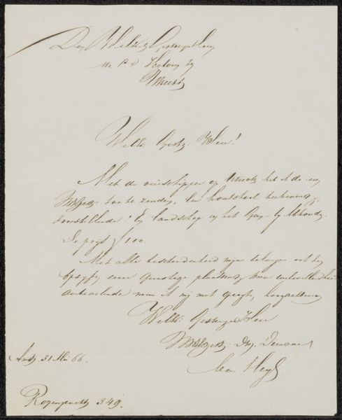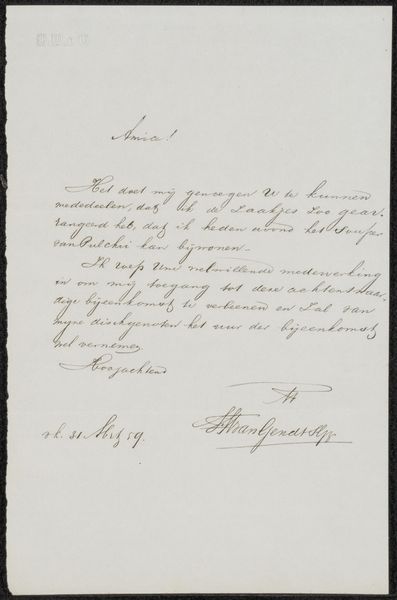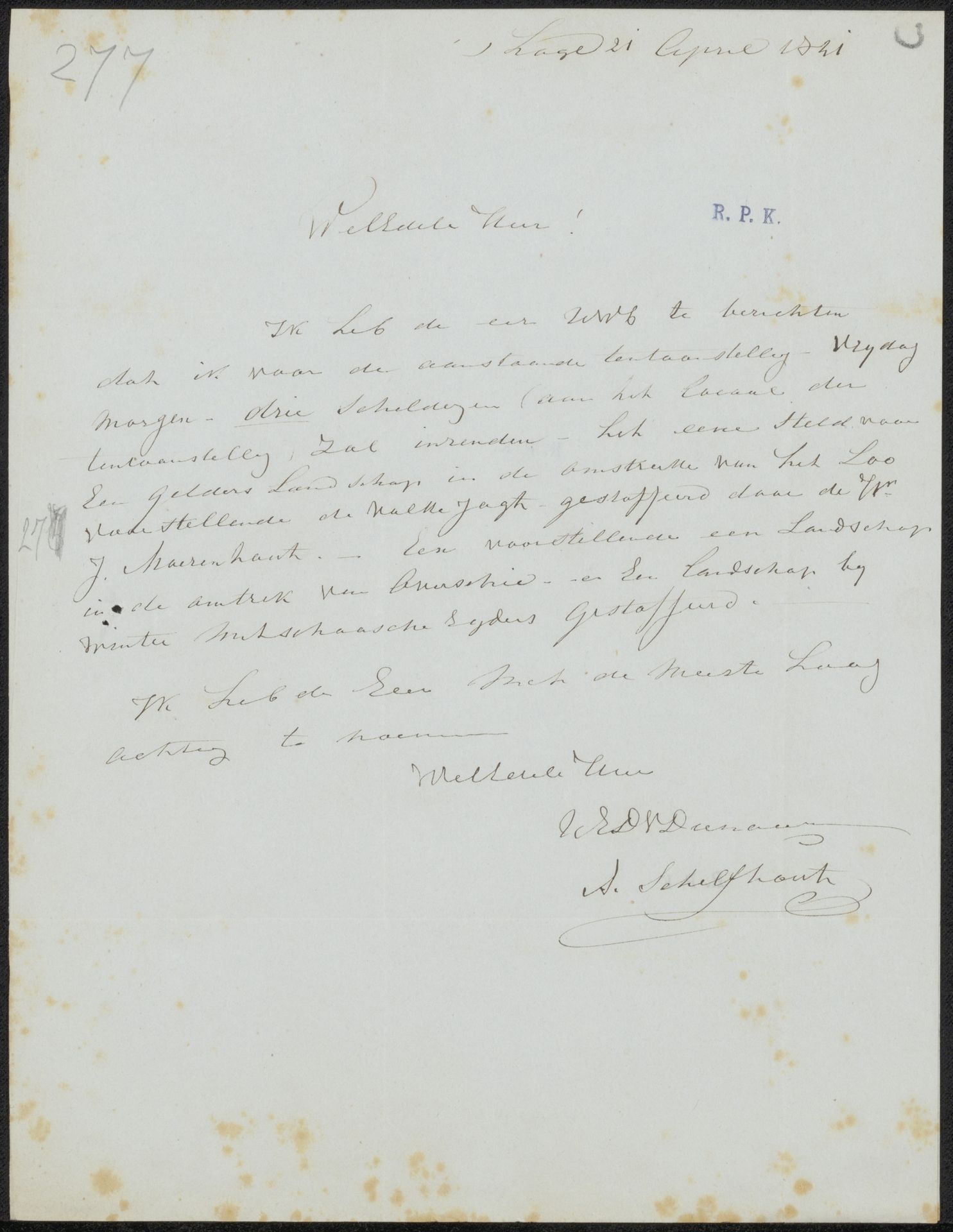
Possibly 1841 - 1844
Brief aan G.M.C. Hooft, secretaris van de commissie van de Tentoonstelling van Levende Meesters in Den Haag
Andreas Schelfhout
1787 - 1870Location
RijksmuseumListen to curator's interpretation
Curatorial notes
Curator: Here we have Andreas Schelfhout's "Brief aan G.M.C. Hooft," likely from the early 1840s, executed in ink and possibly watercolor on paper. The letter appears to be related to an exhibition of some kind, and given the script I think it conveys a sense of both formality and...intimacy. How do you read this work? Editor: Well, since this is a letter, it's a bit different from what we normally discuss, which can be difficult at first. Is it okay to consider the writing itself an aesthetic element and composition choice? What should we, and perhaps can we, look for beyond that? Curator: Certainly. Deconstruction and textual analysis would be beneficial here. Look at the formal qualities. The handwriting creates a dense, almost textural surface, wouldn't you say? The script's looping ascenders and descenders create lines that almost resemble a landscape drawing, echoing Schelfhout's well-known landscapes. Do you notice any intentional placement of words for balance, or perhaps any areas of higher or lower "density?" How might those elements play into a meaning? Editor: I see what you mean, there are differences in density. Also, he’s clearly very skilled in penmanship; each word has uniform texture with its own breathing room from other strokes, so that none bleeds over or feels crowded in its space, adding a unique visual texture with many elements combined! So beyond the semantic content, Schelfhout has controlled all the parts within a whole system, much like a painting! Thank you, I will certainly study artwork and letters as structural objects more consciously. Curator: A fruitful observation, I think! Analyzing the surface in this way enables a far richer reading.