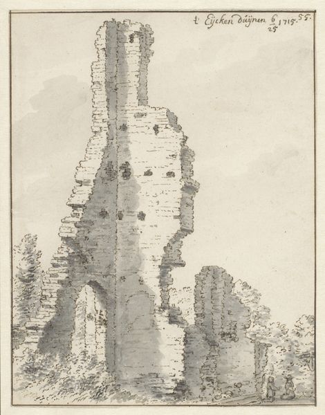
drawing, paper, pencil
drawing
dutch-golden-age
pen sketch
pencil sketch
landscape
etching
paper
pencil
cityscape
realism
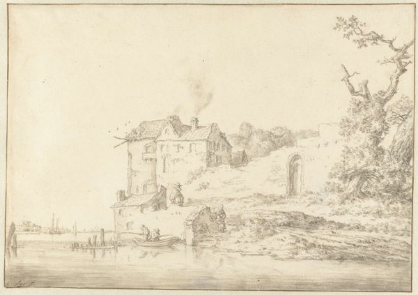
Dimensions: height 96 mm, width 145 mm
Copyright: Rijks Museum: Open Domain
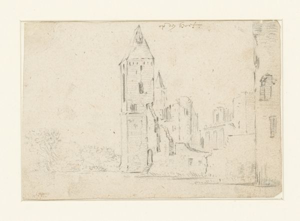
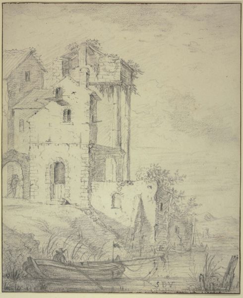
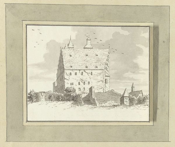
Editor: This is Jan van Goyen's "Plompetoren te Utrecht," a pencil and pen drawing on paper, likely created between 1619 and 1690. It feels so light and airy, almost like a memory fading into the paper. The composition centers on the strong verticality of the tower against the more horizontal buildings. What stands out to you about this piece? Curator: The formal arrangement is indeed striking. The stark, almost geometric form of the Plompetoren punctuates the more organically rendered surrounding structures. Van Goyen here displays a keen awareness of tonal values, particularly evident in the layering of pencil and pen strokes to articulate depth and texture. Observe how the light interacts with the surfaces, creating subtle shifts in perspective. Do you notice the interplay between line and shadow? Editor: Yes, the varying line weights really bring out the structure of the tower, especially where the light hits it. And the rooftops appear so flat by contrast, almost like geometric planes. Curator: Precisely. Note how van Goyen employs a limited palette—the monochrome contributes to an emphasis on form and light. The drawing, rendered with such precision, possesses a certain abstraction, achieved through its rigorous simplification of observed reality. It transcends mere representation, becoming a study in visual syntax. What impact do you think the skyline, very softly indicated, has on the work's overall reading? Editor: It’s almost ghostlike, adding a sense of scale but not distracting from the tower. Seeing how line, shape, and light create such a strong impression is fascinating! Curator: Agreed. Van Goyen's masterful control of form and tonality allows the viewer to appreciate the essence of the subject rather than its mere superficial likeness. I appreciate that its careful composition brings a sense of tranquility and order. Editor: I'm starting to see the intentionality behind every stroke. Thanks for pointing out those key features!
Comments
No comments
Be the first to comment and join the conversation on the ultimate creative platform.