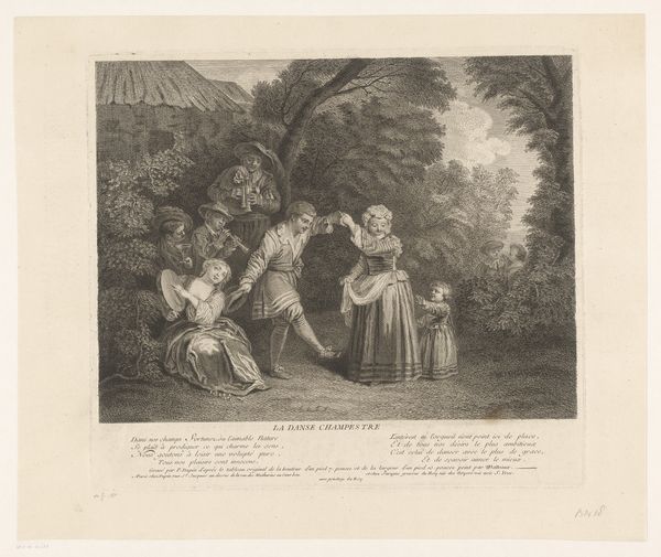
print, etching, engraving
#
baroque
#
ink paper printed
# print
#
etching
#
pencil sketch
#
figuration
#
genre-painting
#
engraving
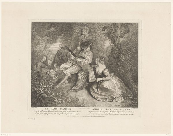
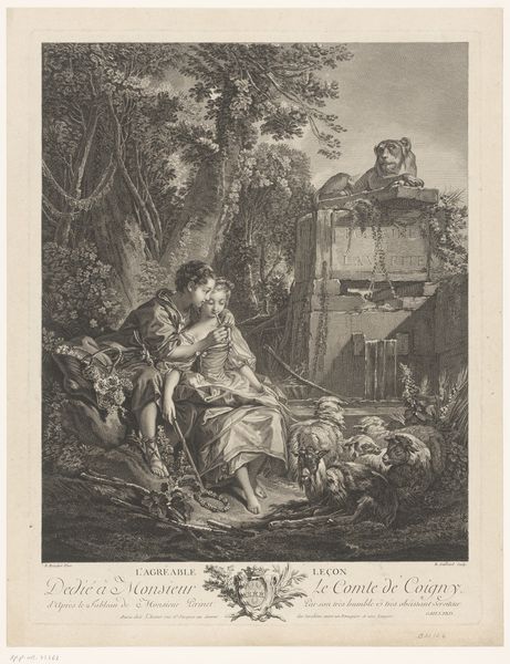
Dimensions: height 390 mm, width 300 mm
Copyright: Rijks Museum: Open Domain
Editor: So, we’re looking at "Musicerend gezelschap," or "Musical Company," a print made by Bernard Baron sometime between 1706 and 1755. It's etching and engraving on paper, held here at the Rijksmuseum. The figures seem really caught in their own world; the details create this lush, contained space. What’s striking about it for you? Curator: Note how the composition invites the viewer into the clearing. The contrast of light and dark, rendered meticulously through etching and engraving, structures the gaze. The interplay between the figures, the positioning of their bodies and direction of their gazes, presents us with a closed tableau, and the tonal gradations define spatial relationships and highlight certain textures and forms. Editor: It really does draw you in! Are you referring to how the lighter tones of the central figures pop against the dark wooded backdrop? Curator: Precisely. Further observe the relationship between line and form. The lines create detailed patterns that give life and texture to each garment, differentiating them, while the figures appear to engage in a concert of the self, the light sources reflecting against their figures and enhancing them into three-dimensional, life-like characters, while maintaining an elegant pattern overall. Notice how the interplay with their clothes in contrast to their body, displays this beautiful relation. Editor: I hadn’t considered how important the fabrics were! It's like the composition itself emphasizes texture and depth with such simple materials. What kind of meaning do you find within the composition? Curator: What meaning could be inferred based only on the composition? Without extraneous cultural interpretation, one can identify an engagement with line, form and the contrast of light against shadow to evoke a highly developed relationship of tones. These compositional components establish both structure and visual balance. Editor: It's fascinating to consider it purely in terms of form! I tend to jump to the historical context right away. Curator: Such contextualization has its place. But prioritizing visual structures first can reveal elements easily missed through imposed narratives. This, then, can only contribute and broaden your appreciation of form within artwork.
Comments
No comments
Be the first to comment and join the conversation on the ultimate creative platform.
More like this