#
capitalist-realism
Copyright: 2019 Gerhard Richter - All Rights Reserved
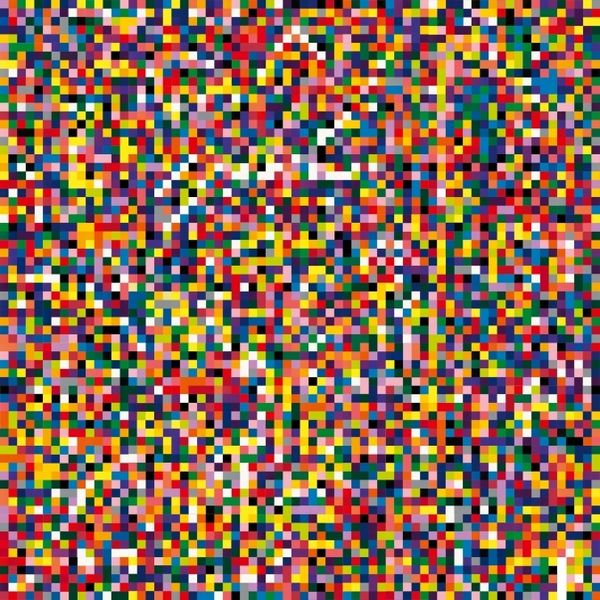
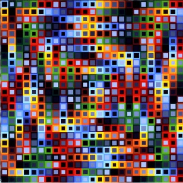
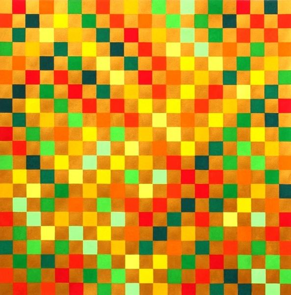
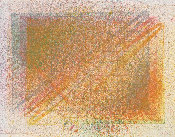
This is Gerhard Richter's "4096 Colours" – and what's fascinating is its rigid, almost digital appearance. It's as if he's thinking through a system, a process, right before our eyes. I find myself drawn to how Richter handles his materials. The paint isn't thick or showy; instead, it's laid down in these clean, precise squares. It's less about the gesture, more about the colour itself. I'm thinking about those little squares of blue right there, nestled amongst the yellows and blacks. There's something about that particular juxtaposition that creates a feeling of harmony but also a visual kick. Richter reminds me a little bit of Agnes Martin, especially in his commitment to a grid structure, but with a completely different mood. Both of them are thinking about how simple forms can carry complex feelings. And really, isn't that what art is all about, this open-ended conversation across time, where meaning is never quite fixed?
Comments
No comments
Be the first to comment and join the conversation on the ultimate creative platform.
More like this