graphic-art, print
#
graphic-art
# print
#
geometric
#
abstraction
#
modernism
Copyright: Hiroyuki Tajima,Fair Use
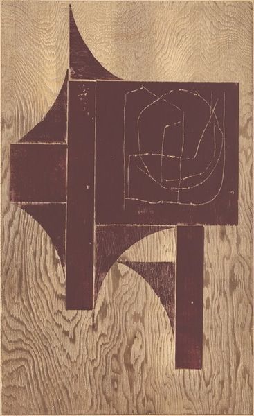
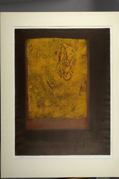
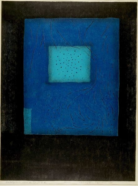
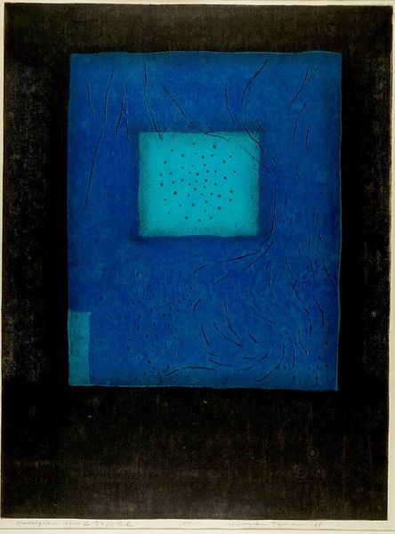
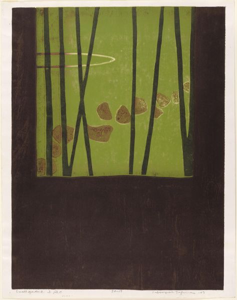
Curator: Today we're considering Hiroyuki Tajima's print from 1967, titled *Almanac*. Tajima worked primarily with graphic art, exploring themes in abstraction. Editor: My first impression is its somber mood—earth tones meet sharp geometry, which strikes me as an interesting dialogue between chaos and order. Curator: The date is essential. Japanese artists after World War II often grappled with questions of identity and tradition versus modernity. We can situate Tajima’s turn toward abstraction in this specific moment, the late 60s, when Japan was experiencing rapid social and economic transformation. He presents both a modernizing force and nostalgic elements of Japanese past. Editor: I agree that these shapes don't present any concrete forms. Instead, I notice how the lines wander almost aimlessly across the piece, counterpointed by the crisp, sharp golden squares. The colors vibrate subtly, particularly between the shades of brown and red, adding a level of visual interest. Curator: It makes me think about Japan's complex relationship with time and progress. *Almanac*. The very title invites a consideration of cycles, histories, and the intersection of the personal and collective experience. Tajima uses abstract geometry as an interrogation, a disruption of conventional perceptions. The two small gold squares might indicate optimism toward progress and industry. Editor: Interesting reading. Though, consider solely from its visual elements, these small geometric shapes introduce balance to what might otherwise be a chaotic image. Perhaps this isn’t merely a commentary on social structures, but also Tajima's pursuit for a pure compositional balance. Curator: But can we truly divorce art from the social and political contexts of its making? To view the composition as pure form ignores the possibility that it represents a reaction *against* something very concrete. He does this through line and geometric shape. The historical importance of Almanac is to create dialogue. Editor: Point taken. Looking again, the dark, muted tones might symbolize a society attempting to overshadow traditional cultural. Yet, within that somber setting, the small geometric elements radiate vibrancy. Thank you. Curator: I concur. Understanding that context enriches our understanding of his work as a visual statement deeply rooted in its time, in addition to visual beauty.
Comments
No comments
Be the first to comment and join the conversation on the ultimate creative platform.
More like this