drawing, graphic-art, typography, ink, poster
#
drawing
#
graphic-art
#
art-nouveau
#
typography
#
ink
#
line
#
decorative-art
#
poster
Dimensions: height 192 mm, width 136 mm
Copyright: Rijks Museum: Open Domain
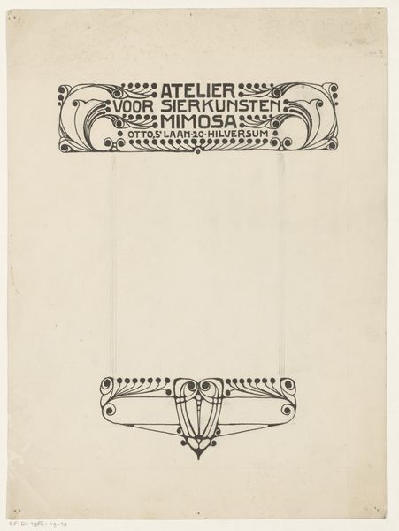
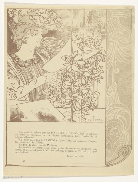
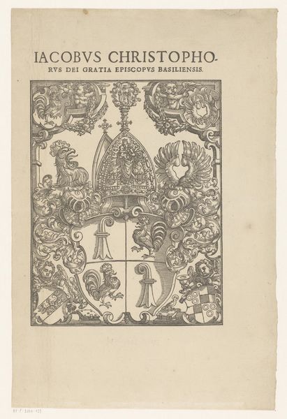
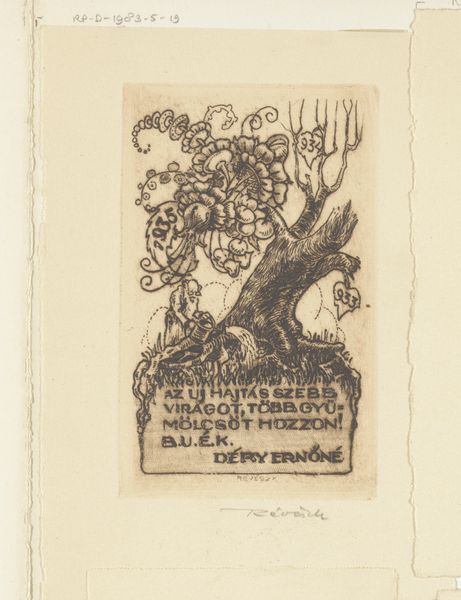
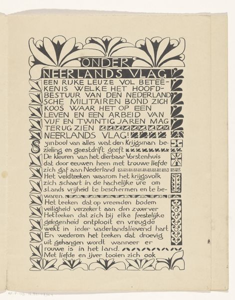
Editor: This is Willem Wenckebach's design for the cover of "De Kunstwereld," a weekly magazine published between 1878 and 1948. It's executed in ink, showcasing both typography and decorative art elements. The overall feeling is quite elegant, a bit old-fashioned in its detailing, like something out of a storybook. How do you interpret the symbolism within this design? Curator: The design breathes the essence of Art Nouveau. See how the lilies aren’t merely decorative but carry an emotional resonance, a visual echo of themes such as purity, beauty, and even transience, depending on cultural context. And consider the placement, framing the title like guardians of art itself. Does the presence of both text and image spark thoughts about the work's deeper meaning? Editor: Definitely. It speaks to the holistic approach to art encompassed by "De Kunstwereld." The borders also hint at musical instruments alongside artist tools, which hints at an inclusiveness toward multiple artforms. What’s interesting is, if these are not randomly chosen, this implies a hierarchy to their organization… Curator: Exactly. Those visual choices become critical in understanding the magazine’s agenda. This isn't just design, it’s cultural signaling. Are the specific addresses listed also meaningful? Rembrandtplein, of course, is strongly linked to art. Editor: I hadn't even thought of that! Connecting that location to art in Amsterdam could solidify it in a tradition... Curator: Consider how location contributes to establishing credibility, while also reflecting back toward history and an earlier age in the Dutch Golden Age. This single cover suggests how one periodical positioned itself within Dutch cultural memory and its future. Editor: This close look has certainly changed how I see this piece. It’s not *just* decorative art but an intricate argument about art itself. Curator: And by understanding visual language and iconography, we tap into layers of meaning far beyond the surface, accessing history itself through a single image.
Comments
No comments
Be the first to comment and join the conversation on the ultimate creative platform.
