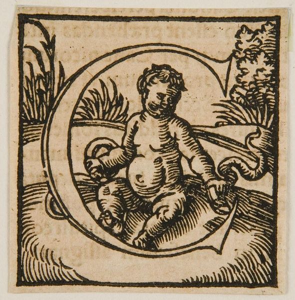
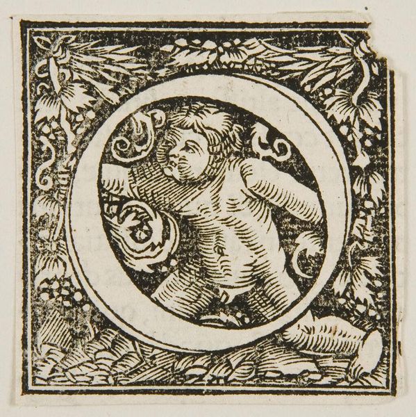
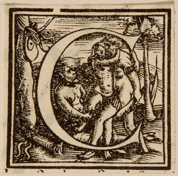
Letter C from the Children's Alphabet by François Fradin c. 16th century
0:00
0:00
Copyright: CC0 1.0
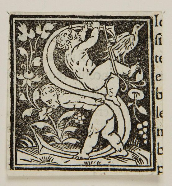
Editor: This is an initial from a children's alphabet, the Letter C, by François Fradin. It features a cherubic figure entwined within the letter's form. What do you see in the arrangement of the figure and the letter itself? Curator: The composition is quite striking. Note how the cherub's limbs mirror the curves of the "C," creating a visual echo. The graphic contrast between the black ink and the negative space of the paper accentuates the tactile quality of the woodcut. Editor: So, it’s about the interplay of shapes and the texture of the lines? Curator: Precisely. Observe how the density of the lines creates a hierarchy, drawing the eye to the cherub's face. It is a study of form and texture, using an economy of means. Editor: I hadn't noticed how the lines directed my gaze. Thanks for pointing that out!
Comments
No comments
Be the first to comment and join the conversation on the ultimate creative platform.
More like this