#
aged paper
#
toned paper
#
paper non-digital material
#
sketch book
#
personal sketchbook
#
journal
#
pen and pencil
#
sketchbook drawing
#
storyboard and sketchbook work
#
sketchbook art
Dimensions: height 169 mm, width 105 mm, height 227 mm, width 170 mm
Copyright: Rijks Museum: Open Domain
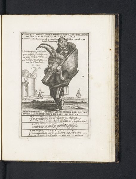
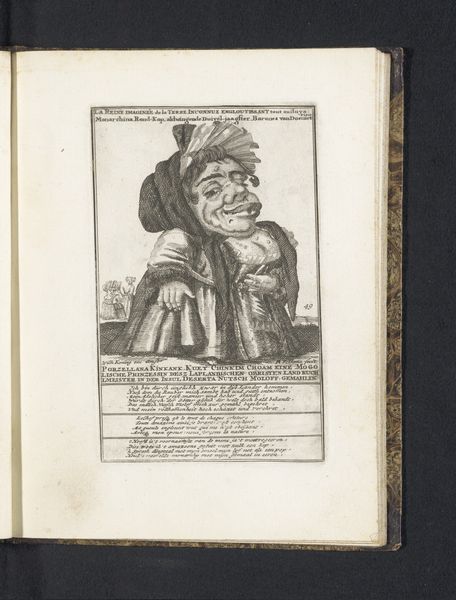
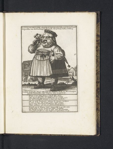
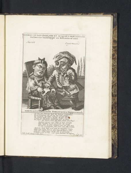
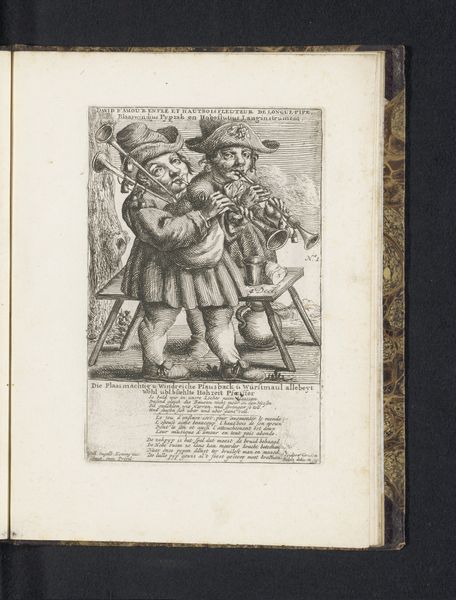
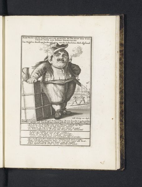
Editor: This piece is titled "De dwerg Slenderhenkius van Poepenland," dating from 1718 to 1720, by Pieter van Buysen Jr. It seems to be a sketch on aged paper with an unusual composition. It has an element of caricature, but I’m uncertain of the figures’ symbolism and how the forms all interact with each other in such a confined space. What do you see in this work, focusing on its intrinsic structure? Curator: I observe a meticulous execution, despite its seemingly whimsical subject matter. The figure dominates the visual field through sheer size and detailed rendering of his form, a deliberate strategy for creating a focal point. Note the artist’s decision to render the foreground figures and props in incredible details; lines, textures and shades play a pivotal role here. Also of significant note are the internal framed elements. How do you think these add or detract from the structuralist significance? Editor: That’s a fascinating take. The figures are expressive and well-composed, adding an element of theatricality. Perhaps these all point to the cultural context surrounding satire at the time. But I was distracted by its subject; how does that tie into a more structural understanding? Curator: Dismiss for now any notions you harbor towards symbolism, cultural and or historical implications and any potential philosophical underpinnings! We can think instead of tonal distribution, textural relationships, line qualities, formal oppositions and the role of the image in organizing all of this visual information on one plane. Does it perhaps create a harmonious balance in this arrangement, where no part overpowers? Editor: It's really helpful to shift my perspective from subject to purely structural qualities. Considering the linear details alongside their composition really spotlights Buysen's use of negative space to elevate the picture's significance. Thanks for expanding my understanding! Curator: Indeed! And considering only structure makes the reading more challenging and rewarding.
Comments
No comments
Be the first to comment and join the conversation on the ultimate creative platform.
More like this