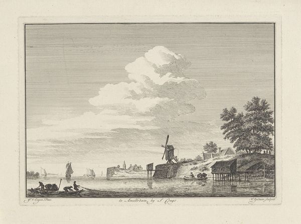
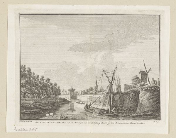
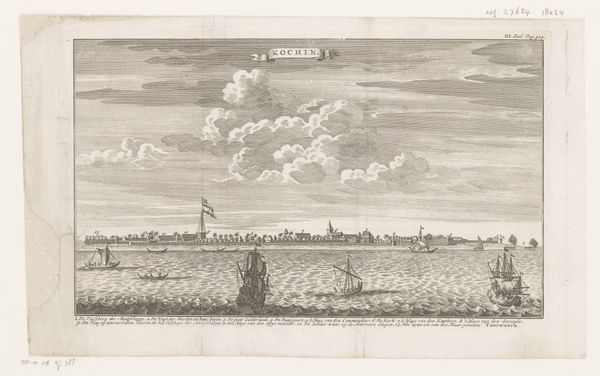
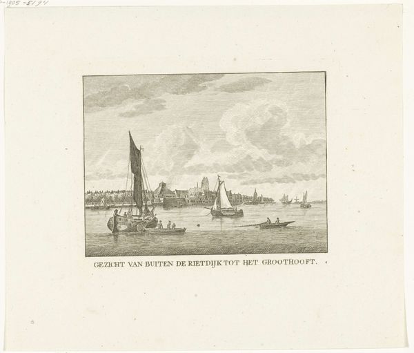
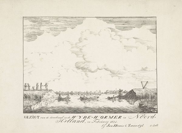
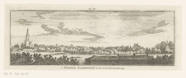
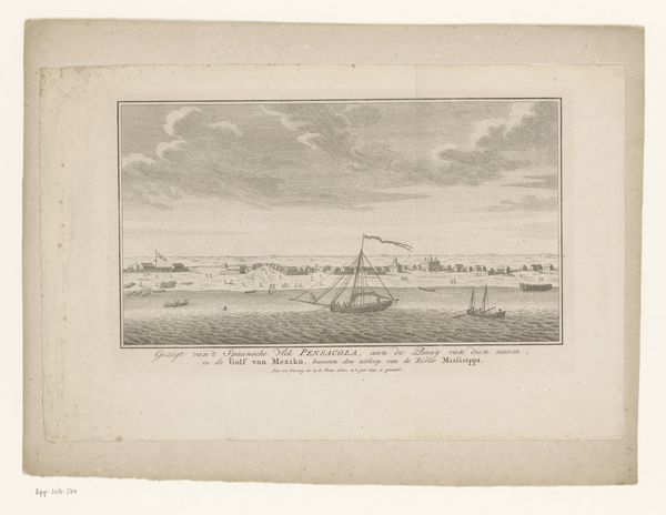
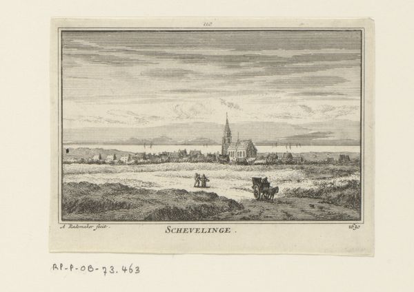
print, etching
#
dutch-golden-age
# print
#
etching
#
landscape
#
etching
#
cityscape
#
sea
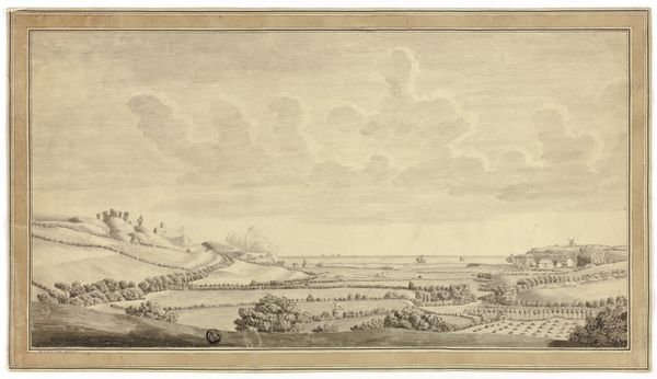
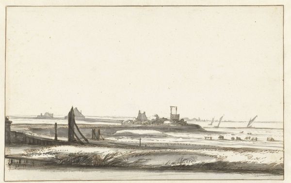
Dimensions: height 81 mm, width 208 mm
Copyright: Rijks Museum: Open Domain
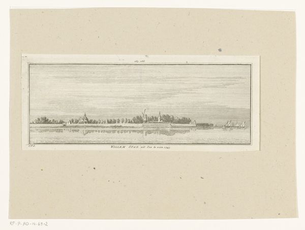
Editor: Here we have Hendrik Spilman's "Gezicht op de Westkappelse Zeedijk, 1743," an etching printed between 1754 and 1792. The landscape feels expansive, but the monochromatic palette creates a somber, almost stoic mood. What strikes you most about its composition? Curator: The success of this etching lies in its sophisticated use of line and texture. Note how the varying densities of etched lines skillfully create gradations of tone. The sky, for example, is rendered with a subtle network of lines that suggest depth and atmosphere, which sharply contrasts with the more definite, heavier lines used to depict the dyke and the figures upon it. This use of line allows Spilman to distinguish between foreground and background, creating a convincing illusion of space within the print's limited tonal range. Do you perceive how the eye is led from the lower-left corner towards the sea? Editor: I see what you mean about being drawn towards the horizon! But aren't the figures significant? The human element gives the artwork life. Curator: While the figures contribute a sense of scale, their purpose resides within the structural rhythm of the image, providing proportional information for the boats on the sea. The essence lies in the contrast between the precise geometry of the built environment and the more organic forms of the natural world. Consider, too, the interplay between the horizontality of the dyke and the verticality of the sailing ships, creating a visually arresting counterpoint. Editor: That’s a different way of thinking about it than I usually do! Curator: These formal elements converge, shaping our engagement with this scene, beyond a literal interpretation of the figures within it. Editor: I understand now. By looking closely at the use of line and form, we can understand the artistry, not just the image. Thanks for pointing that out!
Comments
No comments
Be the first to comment and join the conversation on the ultimate creative platform.
More like this