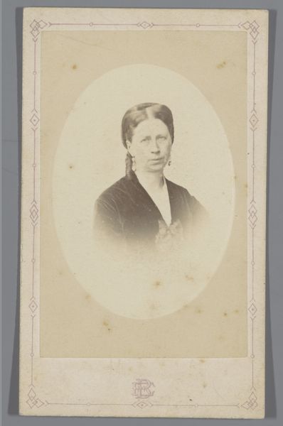
Dimensions: height 105 mm, width 65 mm
Copyright: Rijks Museum: Open Domain
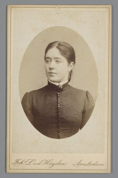
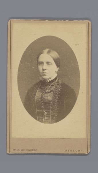
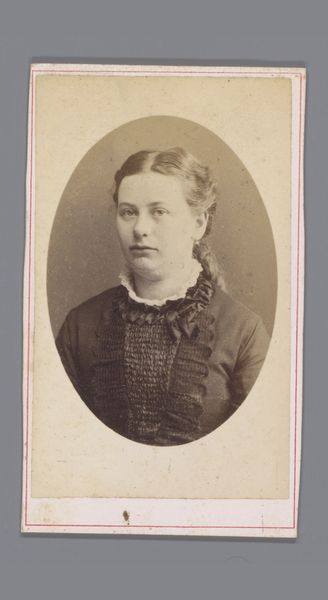
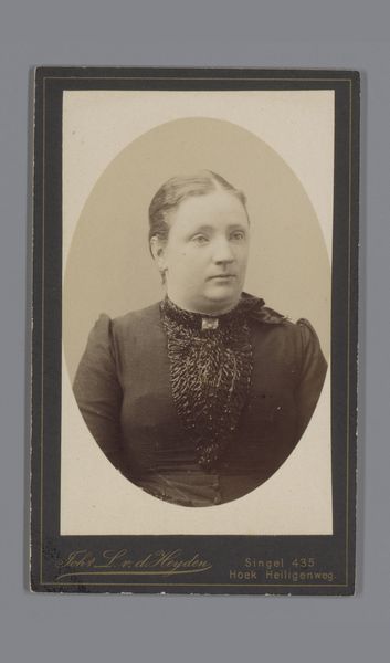
Editor: This gelatin-silver print, "Portret van J.G. Jonker Nije" by Johannes Leonardus van der Heijden, dates from somewhere between 1875 and 1915. There is such directness in the subject's gaze, yet the sepia tone creates a sense of distance. What elements of the composition stand out to you? Curator: Note the oval frame, a conventional choice for portraits of this era, yet it subtly emphasizes the sitter’s face. Observe how the lines of her dress—the vertical pleats and buttons—converge towards the center, focusing our attention. The light, predominantly raking from one side, sculpts the form and brings a three-dimensionality, and textural play, to the otherwise flat photographic surface. Editor: That's fascinating! I hadn’t noticed how deliberate the arrangement of lines and light are. What about the limited palette of sepia tones; does it suggest more than just an aesthetic choice? Curator: It underscores the photograph’s inherent quality of light. The gelatin-silver printing process lends itself to rich tonal gradations, but here, those are constrained, intentionally. The very few colours allow us to focus solely on the nuances of texture and form; the photographic technology's translation of light into a grayscale. Editor: I see now! It’s not just a historical artifact, but a very consciously designed object where the textures, tonal composition, and the form's subtle arrangement all speak to one another. Thanks for opening my eyes! Curator: Indeed! By paying close attention to these elements, we move beyond merely viewing to genuinely seeing.
Comments
No comments
Be the first to comment and join the conversation on the ultimate creative platform.
More like this