Copyright: CC0 1.0
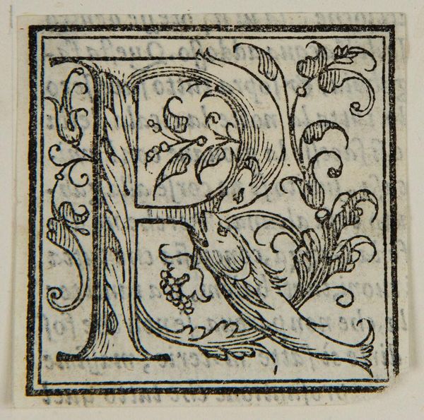
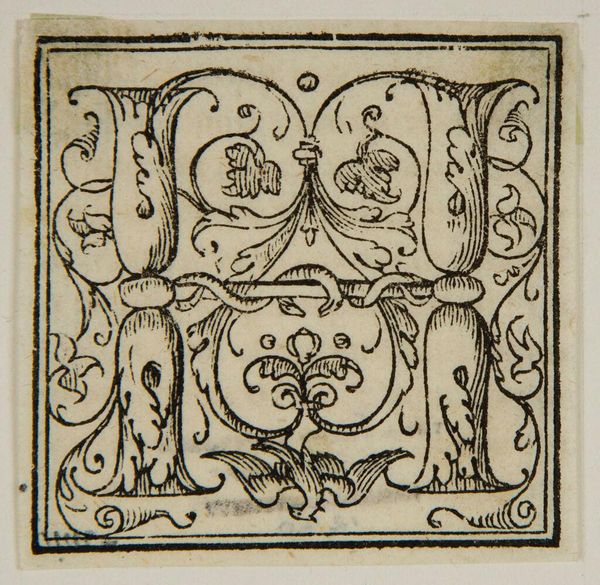
Editor: Here we have "Initial P" by an anonymous artist. I'm immediately drawn to the contrast between the classical figure and the fantastical beast intertwined within the letterform. What stands out to you when you look at this piece? Curator: Notice how the black ink defines the negative space as much as the forms themselves. The composition is fundamentally about the interplay of line and void, creating a balanced tension between figuration and abstraction. What structural elements do you observe? Editor: I see the 'P' shape repeated, but the textures within each repetition are different. I didn't realize how much the negative space contributes! Curator: Precisely! Semiotics teaches us that even the smallest detail carries meaning. Observing these forms, perhaps we can decode the larger cultural narrative. Editor: That gives me a lot to consider. Thanks! Curator: Indeed, a fruitful exercise in visual literacy.
Comments
No comments
Be the first to comment and join the conversation on the ultimate creative platform.
More like this