Copyright: Rijks Museum: Open Domain
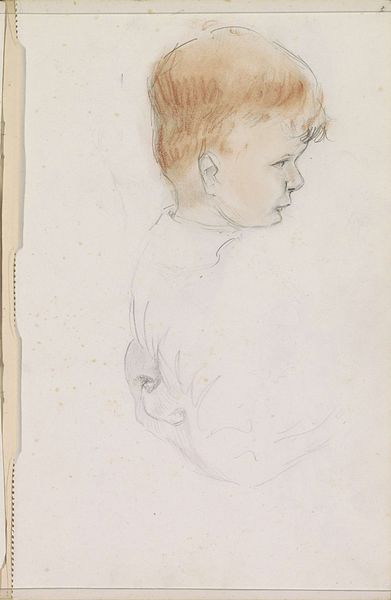
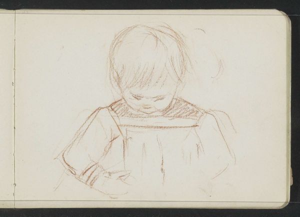
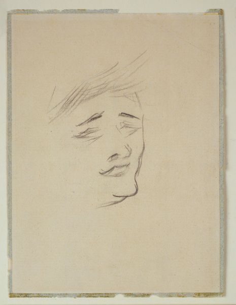
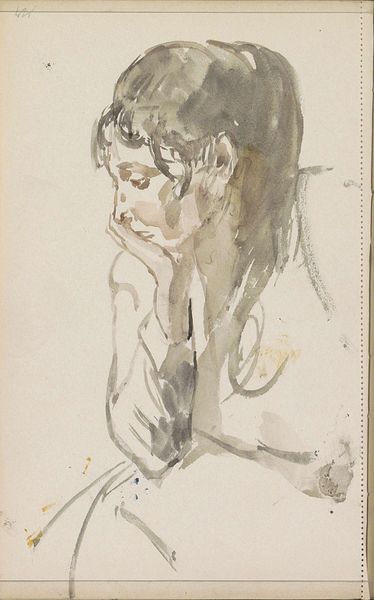
Editor: Here we have "Portret van Otto," created in 1929 using pencil and watercolour on paper. The soft rendering gives it an intimate feel, like a quick sketch capturing a private moment. What elements stand out to you? Curator: The composition compels a rigorous parsing of the work’s visual architecture. Note how the artist orchestrates tonal variation across the subject’s face, generating an internalized perspective through contrasting values. How does this deliberate formal manipulation affect our engagement? Editor: I see what you mean. The darker lines around his eyes and jaw really bring focus to that introspective gaze. Do you think the limited colour palette plays a role, too? Curator: Indubitably. The restricted use of color – predominantly neutral tones with subtle blues and reds – allows formal elements like line and shading to take precedence. Consider the materiality, also; the support, paper, as a visual object, intersects with our reception of the drawing. We see what might appear to be age marks on the paper's surface which serve as part of the image's composition, a deliberate aesthetic statement perhaps? Editor: I hadn’t considered the marks on the paper as part of the composition, but that is interesting! It gives it another layer. I suppose thinking about how those formal aspects affect how we experience the artwork really does add to our understanding. Curator: Precisely. Through this methodical decoding, the artwork yields new layers of interpretive potential.
Comments
No comments
Be the first to comment and join the conversation on the ultimate creative platform.
More like this