drawing, print, etching
#
portrait
#
drawing
#
animal
# print
#
etching
#
landscape
#
figuration
#
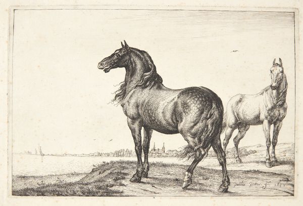
horse
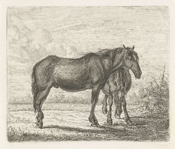
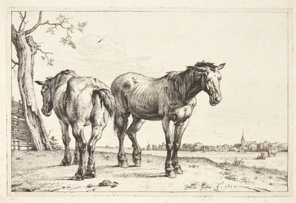
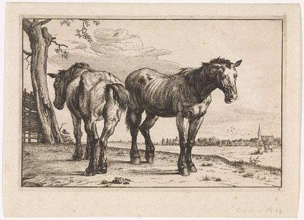
Dimensions: height 93 mm, width 110 mm
Copyright: Rijks Museum: Open Domain
Editor: Here we have Jacobus Cornelis Gaal’s "Twee paarden," created in 1851. It's an etching, a print of two horses in a landscape. It’s so delicate! The line work really captures the horses’ musculature. How would you approach an interpretation of this artwork? Curator: I am drawn to the material reality of this print, the labor involved in its production. Consider the social context: etching allowed for the relatively affordable reproduction of images. Who were the intended consumers of this work? Was it aimed at an emerging middle class with a fascination for rural life and animal husbandry? Editor: That’s interesting. So you’re focusing on the process of its creation and how it might have been consumed… I hadn't thought about it like that. Curator: Exactly! Think about the copperplate, the acid, the press. These are the concrete elements that shaped the final image. The landscape itself might be less about idealized nature and more about the economic realities of agricultural production at the time. Consider also the potential market for prints depicting animals. Editor: So, beyond just admiring the image, we can also consider it a material object tied to specific economic and social forces of the time? Curator: Precisely. The beauty of the etching isn’t just aesthetic; it's intrinsically linked to the means by which it was made and distributed. How does that lens change your initial perspective on the work? Editor: It makes me see beyond just the horses themselves. It’s about the labor, the market, and the people who bought and used these images. Thank you. I'll definitely look at art with that in mind going forward. Curator: And I, with your insight, appreciate again the raw beauty the artist captured by choosing to depict them with their weight visible and rendering the scene simply. It shows that a material focus doesn't mean we must ignore the emotional content!
Comments
No comments
Be the first to comment and join the conversation on the ultimate creative platform.
More like this