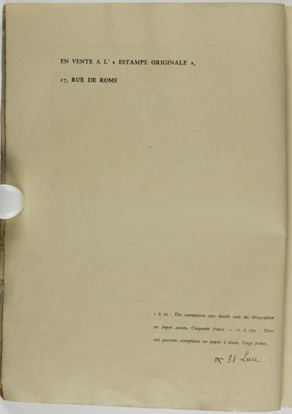
drawing, print, etching, paper, typography
#
drawing
# print
#
etching
#
paper
#
typography
Dimensions: height 502 mm, width 354 mm, height 502 mm, width 698 mm
Copyright: Rijks Museum: Open Domain
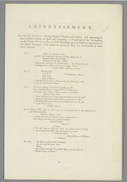
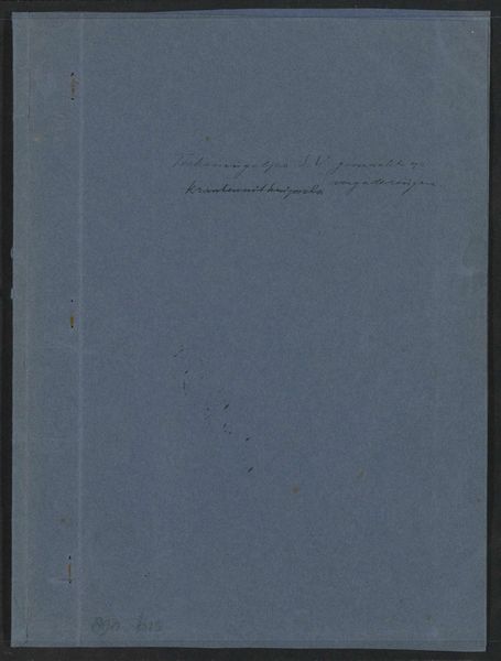
Curator: Here we have Philip Zilcken’s 1888 piece, “Omslag voor twaalf prenten met landschappen naar Jacob Maris,” or “Cover for Twelve Prints with Landscapes after Jacob Maris,” found here at the Rijksmuseum. It's a collection of works incorporating drawing, prints, etching, and typography on paper. What are your first thoughts? Editor: Austere, isn't it? The pale paper, the regimented typography... it evokes a kind of bureaucratic efficiency. I almost hear the clatter of printing presses. Curator: Interesting. For me, the cover is very much a product of its time—the late 19th century—where industrial printing was transforming how art was disseminated. Zilcken’s creation directly addresses the burgeoning print market, the increasing demand to experience and own reproducible artworks accessible to a wider audience. The means of production is right there. Editor: Agreed. Yet, look at the formal arrangement of the text—the centered title, the delicate leading, the subtle hierarchy. The very material quality of the paper contributes to a sense of quiet elegance. It directs your eye down to the numbered list that evokes the landscapes. Curator: Absolutely, and consider the implications of "after Jacob Maris". Zilcken’s work speaks volumes about the role of reproduction in shaping artistic reputations and value. Maris’ landscapes are being packaged and commodified. Editor: Indeed. Still, the aesthetic effect relies so heavily on the relationships of shape and form and light and shadow—negative space allowing your eye to rest before jumping to each piece listed on the index. Curator: From a Materialist perspective, though, it brings up a critical issue: How did industrial methods impact artists’ agency, the value placed on art objects, and consumer access? This piece isn't just a cover. It's part of a complex social system. Editor: Perhaps it is the cover's functional essence—the arrangement of verbal shapes and symbolic references. Still, beyond the historical and social contexts, the elegance lies in how purely Zilcken distilled the composition and the information—directing the viewer to the promise of what awaits in the selection of images it contains. Curator: It's fascinating how two different lenses can highlight such distinct dimensions of the same artwork. I think it makes the cover’s understated quality feel almost radical, in its way. Editor: Yes, seeing the piece in the broader context that you provided illuminates aspects that a more cursory glance would not reveal.
Comments
No comments
Be the first to comment and join the conversation on the ultimate creative platform.
More like this