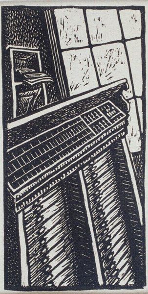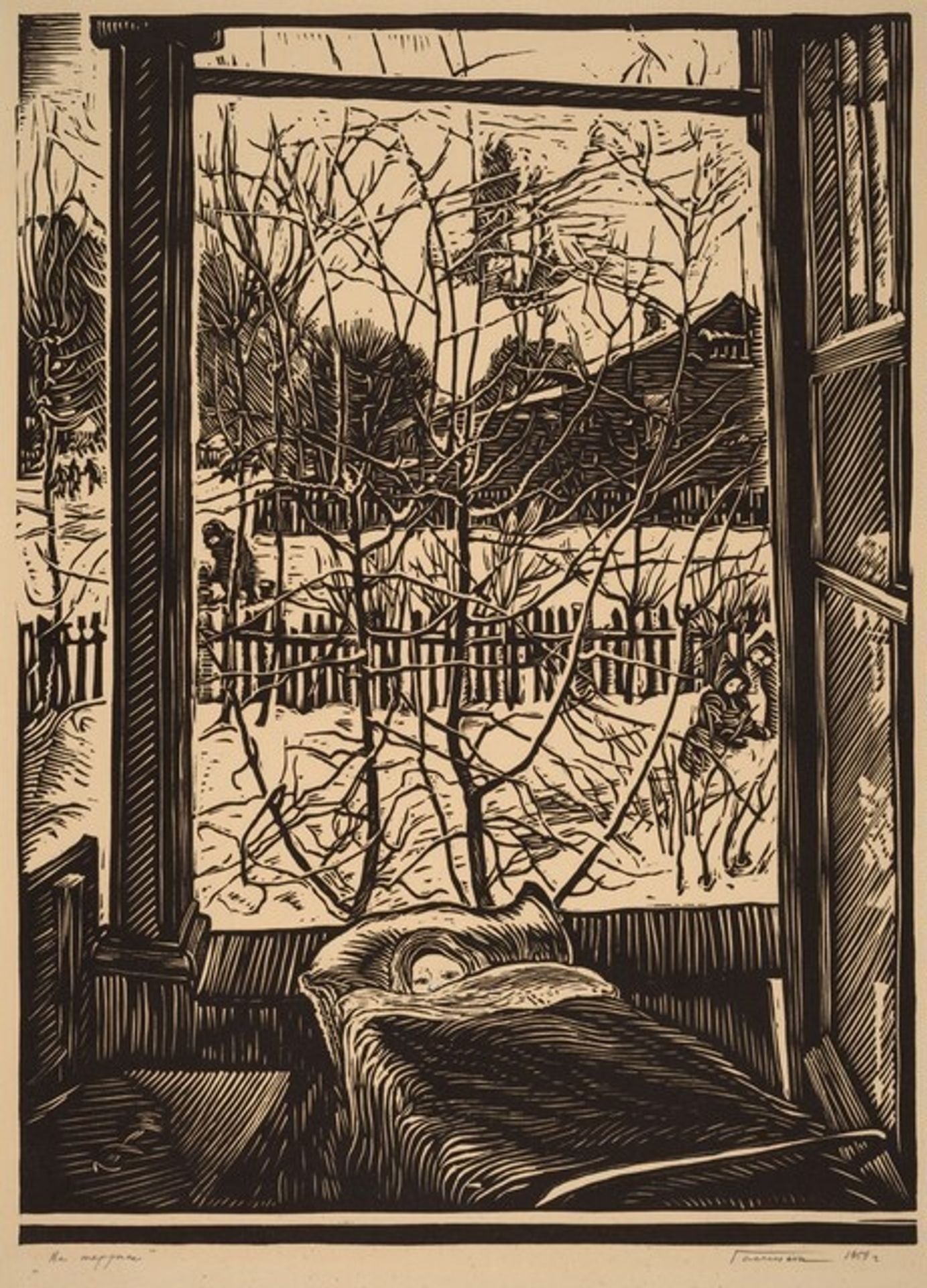
1958
On the Terrace
Listen to curator's interpretation
Curatorial notes
Editor: So, this is "On the Terrace" by Ivan Stepanovich Gomenkov, made in 1958. It’s a woodcut print, and the high contrast is striking. It's making me feel a bit… trapped, maybe? What are your thoughts as you examine it? Curator: It is quite interesting. I see a compelling exploration of interior and exterior space, delineated sharply by the window frame. Notice how the density of lines increases the closer we get to the picture plane, emphasizing the flatness of the print despite the illusion of depth created by perspective. What does this juxtaposition of graphic density and illusionistic depth communicate to you? Editor: I see what you mean about the line work. It almost flattens the scene. The bare trees outside look very detailed compared to the dark, solid mass of the bed inside. So it seems the outside is more realistic, in contrast with the abstraction inside. How does the starkness play into your formalist reading? Curator: Indeed, that contrast is pivotal. The starkness isolates form, forcing us to engage with shape and line divorced from the distractions of color or blended tone. See how the stark winter branches become abstract patterns against the pale sky. Does the artist create visual interest solely through these contrasting elements? Editor: I think so! Like how the sharp angles of the window frame really clash with the organic curves of the branches and bedsheets. The composition keeps the eye moving to capture those elements. This focus allows one to see how basic artistic techniques convey more than subject. I had a very simplified understanding of art and that form does contribute to making a successful artwork. Curator: Precisely. Gomenkov masterfully manipulates line and form. It offers a lesson in seeing. A good way to improve awareness of any artwork.