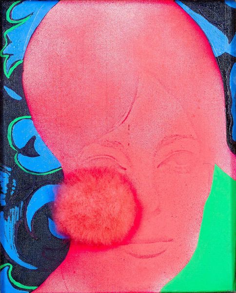
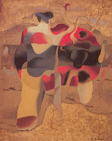
painting, acrylic-paint
#
portrait
#
contemporary
#
painting
#
landscape
#
acrylic-paint
#
figuration
#
neo expressionist
#
portrait drawing
#
facial portrait
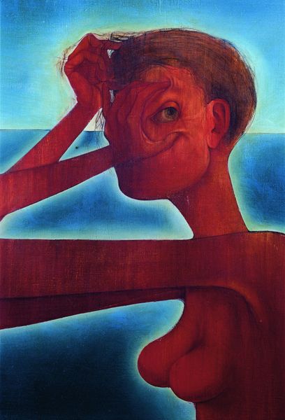
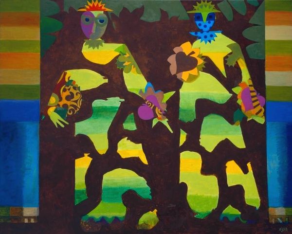
Copyright: Martial Raysse,Fair Use
Curator: Well, what a striking piece. Martial Raysse created this untitled painting, using acrylic paint. It definitely has an alluring mystique to it. What’s your initial take? Editor: I'm immediately drawn to the vibrant redness. It's almost volcanic. It seems the artist wants us to consider materiality itself. What do you think that intensity says in a social context? Curator: Interesting point. This period saw the rise of bold color palettes being used in visual media to capture popular appeal. I mean, it has the kind of intensity one might expect on an album cover or a roadside advertisement. Editor: The redness certainly grabs attention, but notice how thinly the acrylic has been applied, especially considering the era. Look at how the fabric support comes through, blurring that line between surface and substance. What does the landscape contribute here, too? Curator: The landscape serves as a backdrop for the figure, evoking a sort of neo-expressionist mood, don't you think? It is interesting the way the bright reds are positioned next to softer greenery and pastel shades in the background. There are echoes of art from earlier centuries here, repurposed. Editor: Indeed! Also, how does that relationship between figure and ground operate in tandem with this tension in her posture? Is it protective? Contemplative? Is the artist using this pose to suggest themes of internal struggle against a context of natural harmony? Curator: Very possibly. This era sees figurative painting revived through the incorporation of expressionistic elements into art making, a challenge to minimalist practices of the time. Looking back, we can see this portrait of a figure becoming an evocative subject, reflecting a societal fascination with individuality and emotional intensity. Editor: Absolutely, and to bring us back to material terms: the choice of quick-drying acrylic seems vital. It is a choice that permits layers of color, allowing Raysse to produce the kind of depth and vibrant tonal richness to the sitter, despite the medium’s superficial quality. Curator: These color choices really are interesting when taken in the context of art history, specifically painting's complicated history and position in visual culture. It definitely keeps our eyes moving, encouraging deeper consideration of the painting's content. Editor: Considering all of this makes me wonder about the value placed on "high art" versus "pop art" mediums like quick-drying acrylic at this moment. Curator: That's such a critical point, reframing this as more than just a pretty picture. Editor: Right, that shift is crucial for today's audience to truly see Raysse's process and its context.
Comments
No comments
Be the first to comment and join the conversation on the ultimate creative platform.
More like this