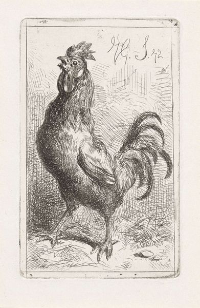
Rooster c. 20th century
Copyright: CC0 1.0
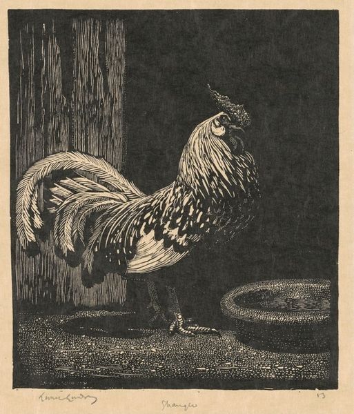
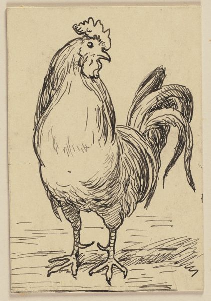
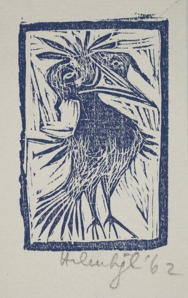
Editor: Here we have "Rooster," a woodcut print by Gertrude Quastler. I’m struck by the bold lines and the overall simplicity. What formal qualities stand out to you? Curator: The stark contrast between the black ink and the untouched paper creates a visually arresting image. Consider the artist's use of line: short, repetitive strokes to define the rooster's form versus the long, vertical lines in the background. Editor: It’s almost like she’s trapped the rooster with those background lines. Curator: Precisely. The structure and composition of the background create a fascinating tension with the foregrounded figure. Also, observe the texture achieved by the woodcut technique itself. The slight imperfections become part of the work's aesthetic. Editor: I hadn’t thought about the imperfections as intentional! Thanks, I'm viewing it in a whole new light. Curator: Indeed, these subtleties provide great insight.
Comments
No comments
Be the first to comment and join the conversation on the ultimate creative platform.
More like this