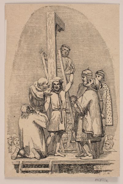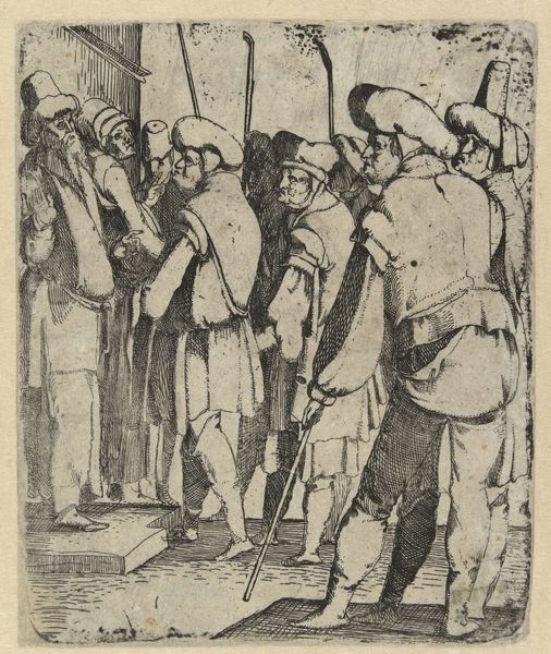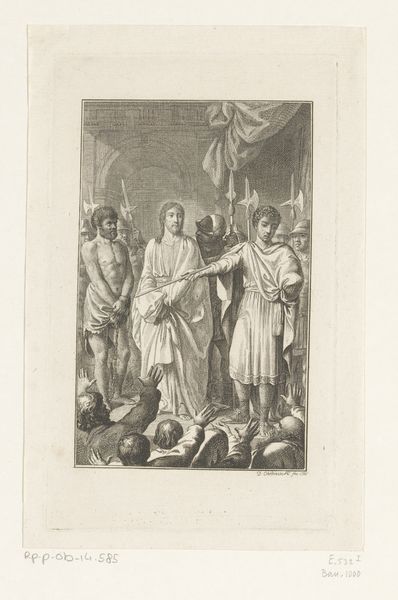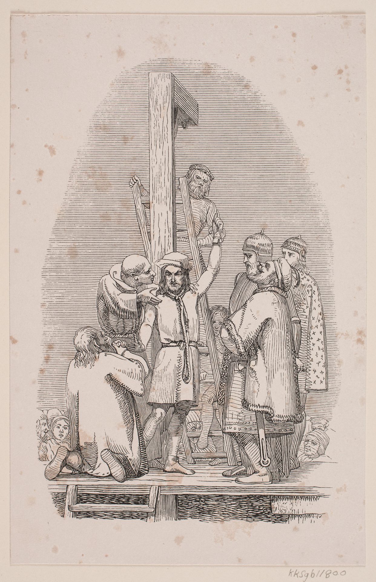
1841
Uglspil ved galgen
Listen to curator's interpretation
Curatorial notes
Editor: This is "Uglspil ved galgen", or "Evil Play at the Gallows," a woodcut and ink drawing made by Andreas Flinch in 1841. It's striking how much detail he achieved with simple lines. What catches my eye is the contrast between the relative clarity of the central figures and the haziness that surrounds them. What do you make of its composition? Curator: I find the deployment of line particularly compelling. Notice how the artist uses varying line weights to create a sense of depth and visual hierarchy. The central figures, rendered with darker, more precise lines, command our immediate attention, while the background is suggested with lighter, less defined strokes. The composition’s success hinges on the stark juxtaposition of crisp detail and atmospheric suggestion. Editor: That’s interesting! The varying line weights do seem to guide my eye to different elements. Are you suggesting the composition is all about contrasting the distinct with the indistinct? Curator: Precisely. Observe the way the solid wood of the gallows provides a strong vertical anchor, stabilizing what could easily descend into chaos. The linear repetition within the gallows itself—the parallel planks, the rungs of the ladder—lends structure to what would otherwise be a scene of disorder and emotional turmoil. But consider the figures; are they unified by line or divided? Editor: Divided, I think. The subjects in the foreground appear contained by meticulous outlines whereas those toward the back almost disappear into the smoky haze. What impression is left with such a disparity of line work? Curator: This stylistic variance creates a visual barrier, separating those closely connected to the spectacle of “evil play” from those forced to spectate from a distance. The work establishes, through these structural and compositional components, both the physical and emotional dimensions of the narrative. Editor: It is remarkable how effectively line weight and the density and spacing of the linework itself defines depth and drama. I didn't recognize it at first! I'll definitely pay closer attention to that aspect in future analyses.