Dimensions: height 450 mm, width 270 mm
Copyright: Rijks Museum: Open Domain
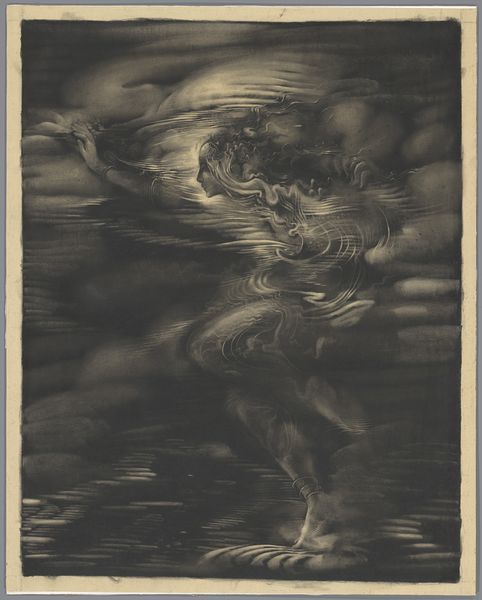
Nicolaas van de Vecht made this calendar page for October through December 1924, and what strikes me is the moody, almost monochromatic palette. It’s like a study in greys, punctuated by these hits of gold. The whole thing feels very graphic and design-oriented, yet there's this soft, dreamy quality to the central image of the figure’s head and a shell. The figure is very lightly rendered with almost no paint on the surface of the paper, whereas the lettering is thick and sculptural. The contrast is just gorgeous. Look at the word "WAARHEEN" – the way it’s rendered in these thick strokes. It’s almost like he's digging the letters out of the surface. This is a really beautiful piece of graphic design, but it’s also a bit mysterious and evocative, like the work of Jan Toorop. It embraces that ambiguity, leaving you with a feeling more than a fixed meaning.
Comments
No comments
Be the first to comment and join the conversation on the ultimate creative platform.
More like this