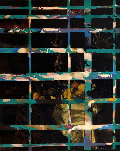
Trompe l'oeil of a Letter Rack with Proclamation by Frederik III 1672
0:00
0:00
oil-paint
#
baroque
#
oil-paint
#
oil painting
#
trompe-l'oeil
Dimensions: 145.5 cm (height) x 183 cm (width) (Netto), 148.3 cm (height) x 187.6 cm (width) x 5.8 cm (depth) (Brutto)
Curator: This is "Trompe l'oeil of a Letter Rack with Proclamation by Frederik III" created in 1672 by Cornelius Norbertus Gijsbrechts, who employed oil paint to trick the eye. Editor: At first glance, I'm struck by the composition. It appears to be an attempt to mimic, so very closely, the everyday chaos that occurs when letters and proclamations take over a room. It's as though Gijsbrechts is meticulously reconstructing visual noise. Curator: Absolutely, the trompe-l'oeil style, "fool the eye" in French, relies heavily on illusionistic techniques. This wasn't simply a display of technical skill; it coincided with a broader political message that the letters hold legal or societal value. Gijsbrechts seems to be referencing the authority wielded via written communication, carefully composed against the backdrop of Frederik III's proclamation. It’s the semiotics of power carefully placed. Editor: Agreed, but that shadow play also grabs attention. The velvety curtain seems to almost break free from the surface. Consider the formal elements: The red gridded rack structure, the dark green hues of the draped fabric that offset the scattered papers—these compositional components generate both a visual game and depth. Gijsbrecht certainly knew what he was doing. Curator: And think about the context! Europe was mired in power struggles; correspondence decided treaties, mobilized armies, shaped national identity. By elevating these humble scraps of paper into the subject of high art, Gijsbrechts implicitly elevates those who control their flow: the politicians and powerful individuals of the day, and even, by association, the artists themselves. It is about cultural and political narratives of 17th century European authority and art. Editor: But does the painting do that effectively? I find a degree of theatrical artifice almost undermines any gravitas that you imply may be its symbolic power. Curator: Perhaps it’s not the raw power itself, but its pervasive, unavoidable nature. It's an early, unsettling vision of bureaucratic authority woven into everyday life and that idea, I believe, translates powerfully across time. Editor: Perhaps the true genius here lies less in its intended socio-political narrative, and more in its ability to continually engage viewers in that play of perception. Curator: Ultimately, Gijsbrechts achieves a potent social commentary by means of representational skill. Editor: And in its masterful manipulation of space.
Comments
statensmuseumforkunst about 2 years ago
⋮
Envelopes were not used in the seventeenth century; in-stead, letters were folded up and sealed with red wax and a signet. This letter rack holds many letters, opened and un-opened, as well as wax sticks marked by soot from being heated over a candle. There is also a vanity case, a large purse, combs, writing imple-ments, sheet music, a pair of scissors and much more. In the middle hangs a large doc-ument: a proclamation bearing the calligraphic headline “….Tertius Dei Gratia ….”, the Latin introduction used for proclamations during the reign of Frederik III. Given that Frederik III died two years before the painting was created, its proclamation offers a kind of memorial to the late king, who appointed the Flemish artist Cornelius Norbertus Gijsbrechts as court painter in 1668.
Join the conversation
Join millions of artists and users on Artera today and experience the ultimate creative platform.
More like this