Copyright: Richard Paul Lohse,Fair Use
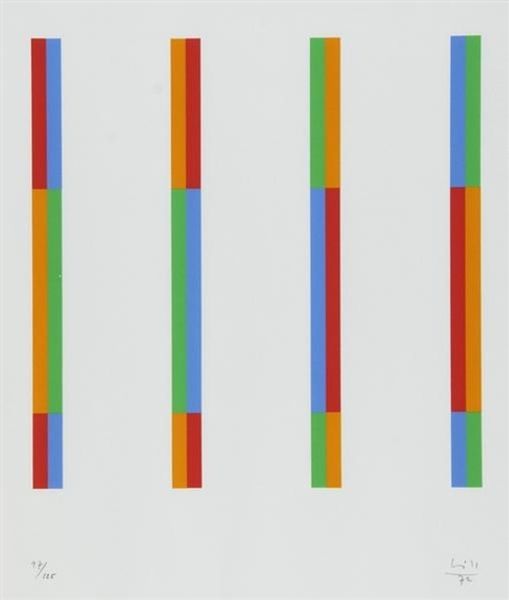
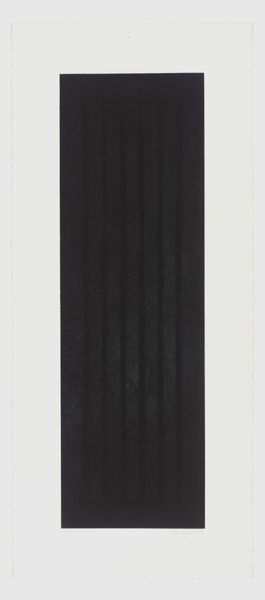
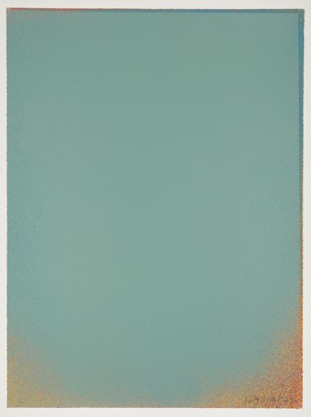
Editor: So, this is Richard Paul Lohse's *Farbstreifen*, created in 1972 using ink. It strikes me as so simple, almost calming with the repetition of those pale green and pink stripes. What do you see in this piece? Curator: I see a reflection of post-war anxieties, believe it or not. Lohse, emerging from a Switzerland grappling with its neutrality during the war, uses this rigid structure to explore social organisation. Notice how the colors interact: is it harmony or imposed order? Is the grid a symbol of egalitarianism, or of societal control, hinting at power structures embedded even in abstraction? Editor: Control... interesting. I hadn't considered that. I was mainly looking at the color relationship, and it's affect on me. Is that a valid reading? Curator: Absolutely! The colors are undeniably important. Consider how the interplay of pink and green might challenge traditional gender norms, particularly within the context of 1970s societal shifts. Does the flatness evoke a sense of industrialization and a commentary on the mechanization of labor, pushing back on pre-established gender and class dynamics? Editor: So, the rigid lines could also be seen as... anti-establishment? As a subversion of expectation by dismantling structure itself? Curator: Precisely. Abstraction often holds revolutionary potential precisely because it requires us to look beyond the surface. Do you think Lohse provides a prescription, or a description, of how societal shifts impact our cultural understanding? Editor: A description, definitely. It shows the tension without resolving it. I never thought minimalism could hold so much complexity. Curator: Exactly, it's not just about what’s there, but about the socio-political contexts they echo. It makes you think about what order *means*, not just what it looks like. Editor: I will definitely carry that with me from now on! Thank you.
Comments
No comments
Be the first to comment and join the conversation on the ultimate creative platform.
More like this