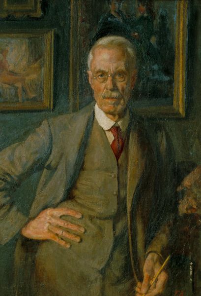
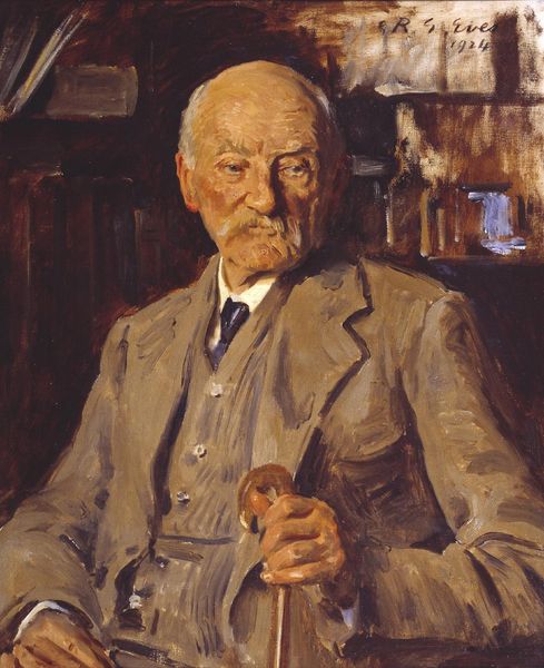
Dimensions: 54.5 cm (height) x 47 cm (width) (Netto)
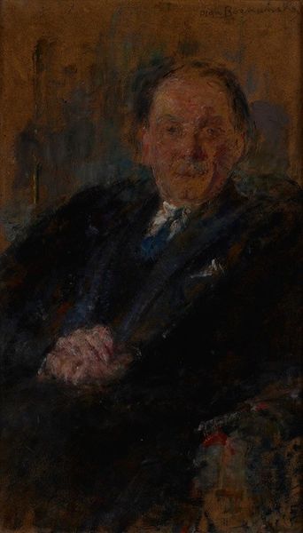
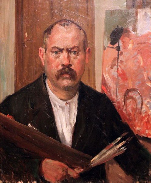
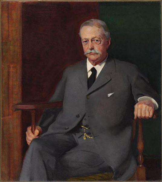
Editor: Here we have Peter Hansen’s “Maleren Theodor Philipsen,” from 1919. It's an oil on canvas portrait, and I’m struck by how the brushstrokes, especially in the background, almost abstract the scene. What catches your eye when you look at this portrait? Curator: It is interesting how Hansen utilizes the materiality of paint to render not just the likeness of Philipsen, but also the textural quality of his surroundings. Notice the contrast between the smoother, blended strokes defining Philipsen's face and the more impastoed touches in the chair and backdrop. Do you see how this contrast creates a subtle dynamism, a visual tension? Editor: Yes, the textured brushstrokes make the background seem almost restless, while Philipsen himself is much more still and defined. It’s like there’s a hidden energy surrounding him. Curator: Precisely. And consider the formal composition. The figure is centrally positioned, yet the slightly asymmetrical arrangement of the background elements prevents a static reading. The color palette is restrained, dominated by earth tones, yet there are moments of chromatic intensity in the patterned chair fabric, adding a subtle visual counterpoint. Do you agree? Editor: Definitely. Those hints of red and orange really pop against the cooler tones. It keeps the painting from feeling too muted, and creates interest to the composition. Curator: Indeed. The artist guides our eyes through a sophisticated interplay of texture, color, and composition, wouldn't you agree? Editor: Absolutely. I had focused on the face, but I see now that Hansen is achieving an overall visual experience through the contrasting textures and colors. Thank you.
Comments
No comments
Be the first to comment and join the conversation on the ultimate creative platform.
More like this