Dimensions: height 245 mm, width 298 mm
Copyright: Rijks Museum: Open Domain
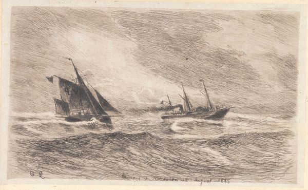
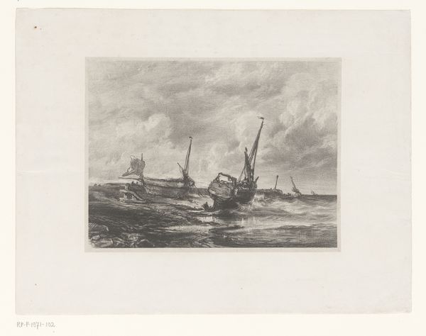
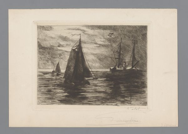
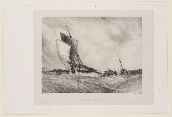
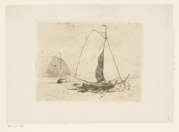
Editor: So, this watercolor by Omer Coppens, "Twee schepen op zee," created sometime between 1874 and 1909… It feels really dramatic, with those churning waves. The color palette makes it look a bit ominous. What stands out to you about it? Curator: It's compelling because it reveals the intersection of Romantic ideals and the material realities of maritime life. Look at the steamship – it’s not just a vessel, but a symbol of industrial progress impacting labor practices at sea. What kinds of labor would these two boats be enabling? Editor: Maybe fishing on the sailing boat and trade on the steamship? It's interesting how he contrasts them. One propelled by wind, the other by steam... Curator: Precisely. The use of watercolor, a readily accessible medium, also speaks volumes about artistic production and accessibility during that era. How do the qualities of the medium—the wateriness, the fluidity—affect the overall impact, compared to, say, oil paint? Editor: It almost softens the scene despite the dramatic waves, giving it a slightly less "finished" quality compared to oils, maybe making it more approachable? It seems more immediate and raw. Curator: Consider too how paintings like these are commodities. They were bought, sold, and circulated. Who had access to scenes like these, and what impact did these images of seafaring have on broader society, especially given the growth of maritime trade? How does seeing labor represented here versus in real life change its meaning? Editor: I hadn't really thought about that... It frames the romantic view of boats as actually workplaces! Curator: Exactly. It gives us a peek into a crucial aspect of how life looked then. Editor: Seeing how these details connect with the materials and social context opens a new perspective. Thanks! Curator: Agreed. Analyzing art from a materialist view enhances our understanding.
Comments
No comments
Be the first to comment and join the conversation on the ultimate creative platform.
More like this