graphic-art, print, etching, paper
#
graphic-art
# print
#
etching
#
paper
Copyright: National Gallery of Art: CC0 1.0
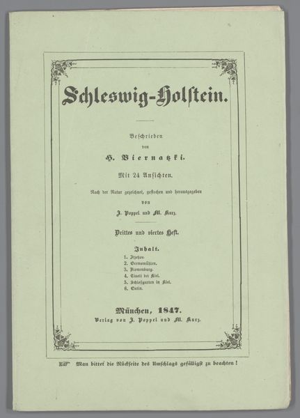
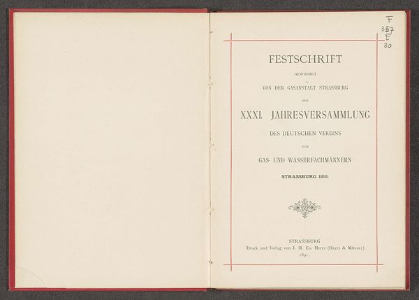
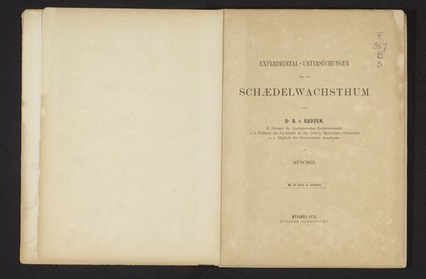
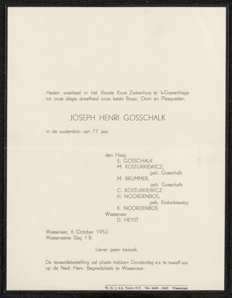
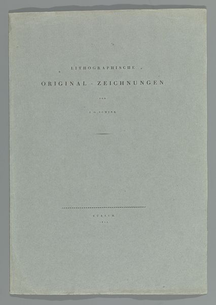
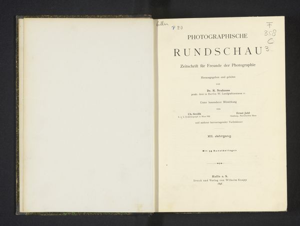
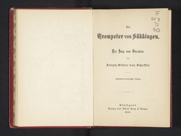
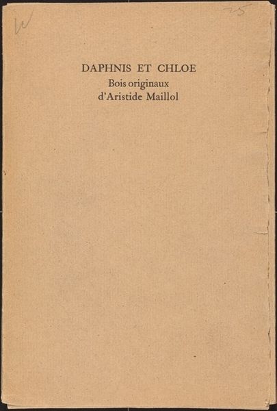
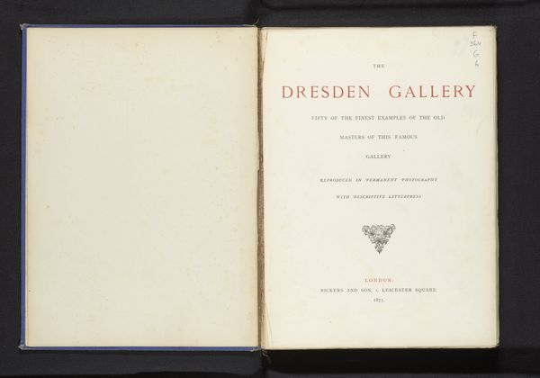
This is the cover of Imre Reiner's portfolio of ten etchings on the theme of theater. The artist's choice of typography—its weight, scale, and arrangement on the page— establishes a visual hierarchy that guides the viewer's eye. Thinking about the "physicality" of fonts, I'm reminded how, like a painter mixing pigments, the typographer selects letterforms, arranges them in space, and adjusts the spaces between them, all in pursuit of a specific effect. Here the even spacing between each character creates a sense of calm clarity. The title is rendered in a clean, sans-serif typeface, which contrasts with the more traditional, serif typeface used for the credits, creating a dynamic visual dialogue. It’s a great example of how less can be more, how simplicity can be a powerful tool for communication and expression. It reminds me of the work of Jan Tschichold, who also explored the intersection of typography and design, pushing the boundaries of visual communication. Art's all about conversation.
Comments
No comments
Be the first to comment and join the conversation on the ultimate creative platform.
