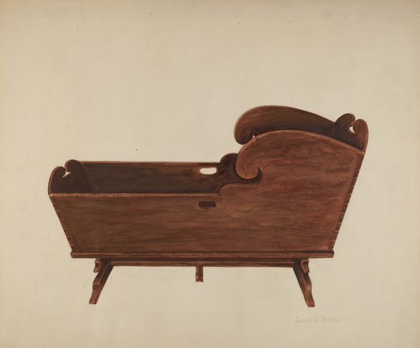
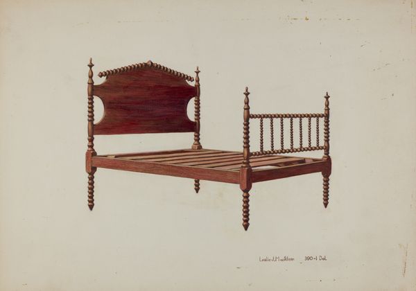
drawing, watercolor
#
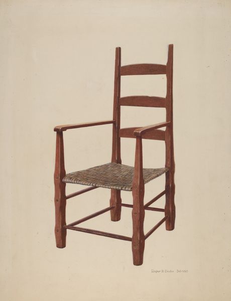
drawing
#
watercolor
#
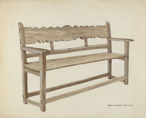
watercolour illustration
#
academic-art
#
watercolor
#
realism
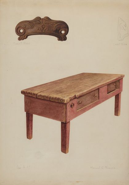
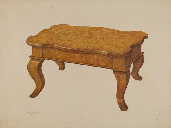
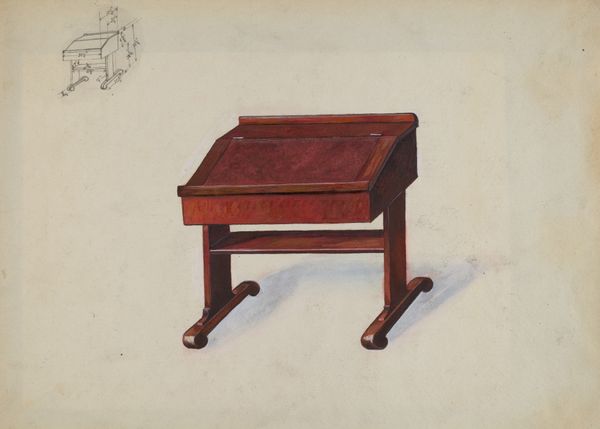
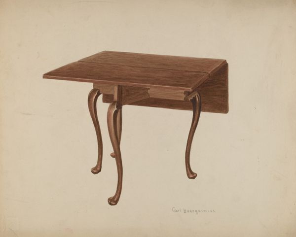
Dimensions: overall: 24.4 x 35.7 cm (9 5/8 x 14 1/16 in.) Original IAD Object: 3'8"high; table: 50"x21"x5". See data sheet for details.
Copyright: National Gallery of Art: CC0 1.0
Curator: Well, that's rather charming. A very simple thing, but executed with considerable skill. Editor: You're right, there's something pleasing about its directness. Before us, we have "Dutch Sink," a watercolor and ink drawing completed around 1939 by Ernest A. Towers, Jr. Curator: What strikes me is the craftsman's touch evident even in its representation. It seems more than just an object; it's an embodiment of labor and function, a subtle commentary on the everyday tasks it would have supported. Editor: Indeed, consider its time period. The late 1930s were a period of great social change and the increased valuing of practicality. How might this piece have served, as propaganda, to communicate something about the relationship between domestic space and the labor that occupied it? Curator: Perhaps there’s an exploration of material culture here, too. The specific choice of wood, the joinery visible even in this illustration – it points to particular values around craftsmanship and local materials during that era. One thinks about consumption...who used it? Did they value functionality or design? Both? Editor: That's a keen observation, reminding us that even the humblest of household items were enmeshed in social relations and historical conditions. And, even more simply, it points to a potential trend among American illustrators in this period toward rendering practical or functional objects in watercolor. Curator: Absolutely, the artist might have hoped to show it in exhibits—perhaps at galleries and museums dedicated to works-on-paper media, with drawing gaining increasing legitimacy and market visibility by the mid-20th century. Editor: The beauty of approaching it in this manner is we can speculate about cultural movements but consider the context in which artists engaged with ordinary objects. What do you make of the artist’s decision to foreground it so plainly? Is it to make us think? Is it pure appreciation? Curator: It provokes some kind of evaluation of what “art” could and should depict during that era. By taking such a common utility and placing it under consideration in watercolour form, it suggests an elevating effect – we’re making the mundane marvelous and reconsidering what merits artistic portrayal. Editor: It provides new meaning for something typically overlooked; it causes the familiar to look unknown, a curious item from a moment gone by. Thanks to the artist’s hand, and our modern view of the historical trajectory of 20th-century culture, it becomes both relevant and strange.
Comments
No comments
Be the first to comment and join the conversation on the ultimate creative platform.
More like this