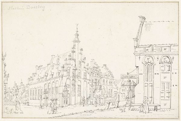
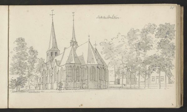
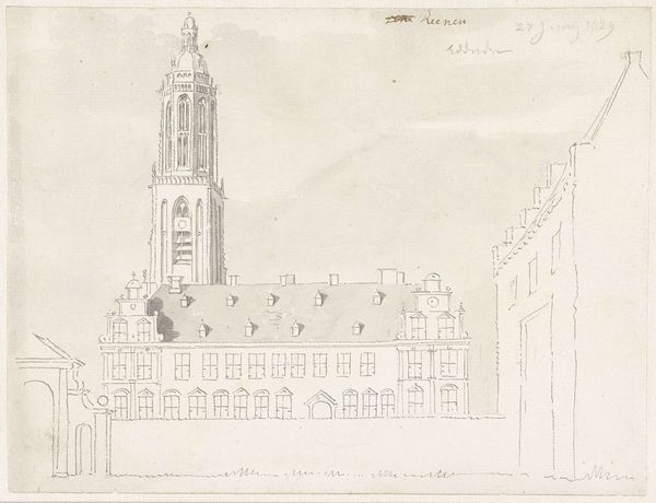
drawing, paper, ink
#
drawing
#
landscape
#
paper
#
ink
#
cityscape
#
street
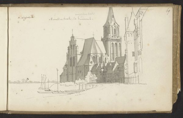
Dimensions: height 153 mm, width 202 mm
Copyright: Rijks Museum: Open Domain
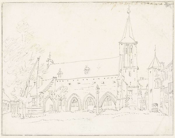
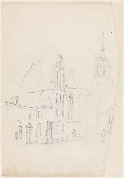
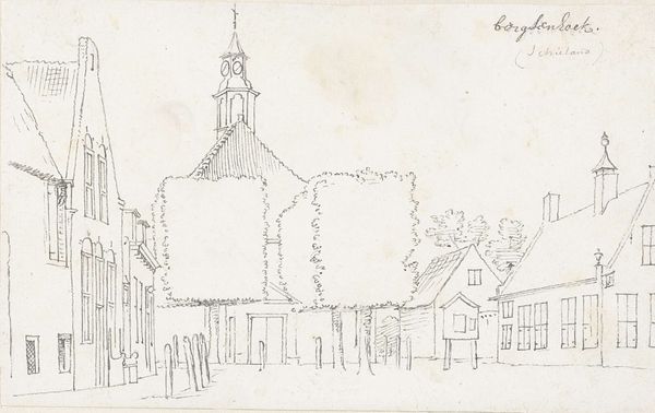
Editor: Here we have Cornelis Pronk’s "The Church and a Drawbridge in the Village of Leur, Brabant," likely from 1729. It’s a delicate drawing in ink on paper, showing a Dutch cityscape. It almost feels like a quick sketch. What do you see in this piece, from a formalist perspective? Curator: Immediately, the linearity stands out. Pronk has meticulously constructed the composition through a network of fine, precise lines. Notice how each building, including the church and the houses, is defined not by tonal gradations or shading, but through contour. It's the *relationship* between these lines, creating geometric shapes and delineating spatial arrangements, that dictates our understanding. How does this emphasis on line affect your perception? Editor: I suppose it makes me focus more on the structure of the scene rather than any emotion it evokes. The precise lines feel almost architectural. Curator: Precisely. The structural integrity of the buildings becomes paramount. Consider the way Pronk articulates the church tower, breaking it down into distinct, geometric tiers. He emphasizes the modularity of the structure, its logical progression from base to spire. Furthermore, the drawbridge, functioning as a visual anchor in the foreground, utilizes straight lines and rigid angles to establish depth and perspective. This technique guides the viewer's eye towards the main subject, the church. Editor: So it's all about the relationships between these shapes? Curator: Yes, and the negative space that these shapes create, which further enhances our understanding of their structure and the overall composition. There's a delicate balance between positive and negative forms that dictates how we visually navigate the artwork. The artist makes choices regarding scale, proportion, and linear perspective that ultimately shape the viewer's understanding and appreciation. How do these linear elements change your impression of Dutch landscape drawings in general? Editor: I'll definitely be looking at other landscapes with an eye for line and form now! I appreciate how you focused on the bare bones of the drawing, the basic elements and how they create a whole.
Comments
No comments
Be the first to comment and join the conversation on the ultimate creative platform.
More like this