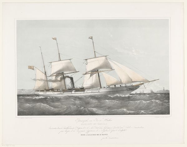
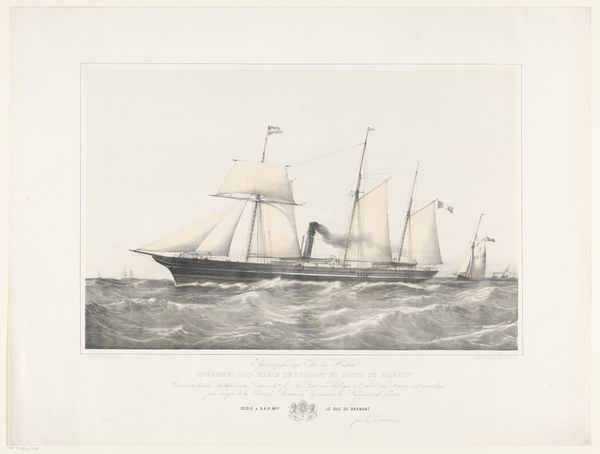
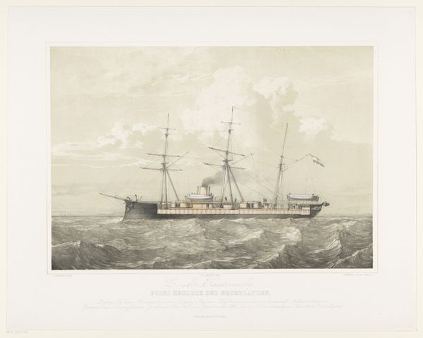
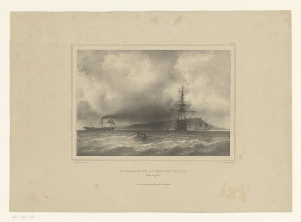
Schroefstoomschip Prins Hendrik der Nederlanden varend op zee 1870 - 1874
0:00
0:00
johanconradgreive
Rijksmuseum
Dimensions: height 496 mm, width 634 mm
Copyright: Rijks Museum: Open Domain
Editor: This is Johan Conrad Greive's "Schroefstoomschip Prins Hendrik der Nederlanden varend op zee," an engraving from around 1870 to 1874. The monochrome print seems to capture a moment of transition, with both sail and steam represented. How do you interpret the visual language used here? Curator: Observe the composition. The ship, the focal point, is meticulously rendered, showcasing Greive’s attention to detail. Note how the artist uses line and tonal variation to depict the waves—a rhythmic, almost geometric pattern. Do you see any interplay between these formal elements? Editor: The waves do have a pattern, yes, and their darkness really contrasts with the lighter sky. It makes the ship stand out even more, especially with the smoke rising. Curator: Precisely. That sharp contrast, created through gradations of light and shadow, enhances the visual drama. Greive employs the engraving technique to achieve a high level of precision and clarity. Consider also the placement of the ship—slightly off-center, allowing for a dynamic tension within the pictorial space. This avoids static symmetry, which contributes to a more engaging visual experience. How does this distribution impact your perception? Editor: It keeps the eye moving, like the ship is going somewhere. The technique almost gives it a photographic feel, despite being an engraving. It’s quite compelling formally. Curator: Indeed. By analyzing Greive’s choices in composition, light, and technique, we begin to understand how the engraving transcends its representational subject and operates as a complex system of visual relationships. I found this analysis insightful! Editor: Yes, seeing it that way really illuminates the print beyond just its subject matter. Thank you!
Comments
No comments
Be the first to comment and join the conversation on the ultimate creative platform.
More like this