drawing, paper, ink
#
drawing
#
aged paper
#
hand written
#
hand-lettering
#
hand drawn type
#
hand lettering
#
paper
#
personal sketchbook
#
ink
#
hand-written
#
hand-drawn typeface
#
fading type
#
handwritten font
#
monochrome
Copyright: Rijks Museum: Open Domain
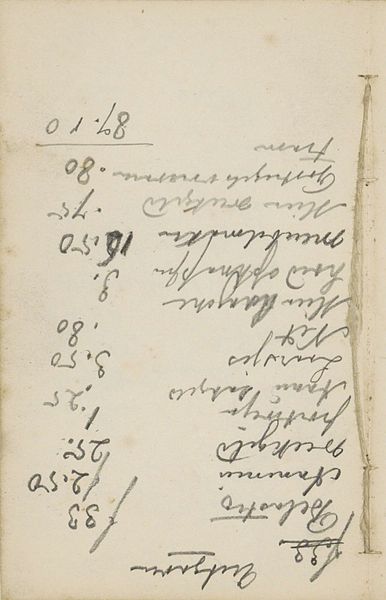
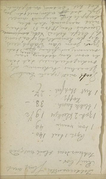
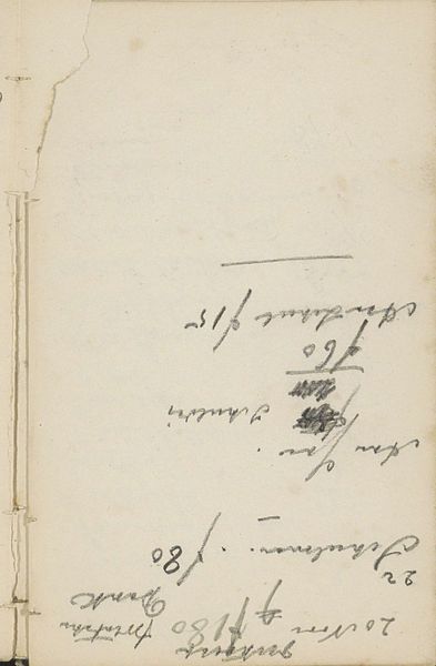
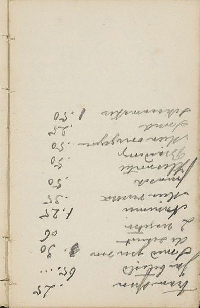
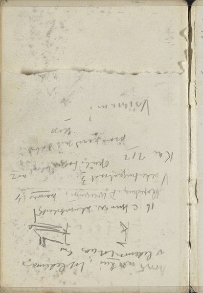
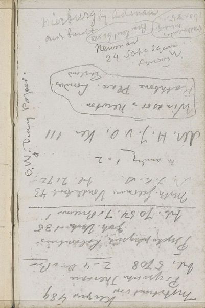
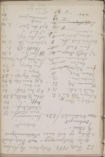
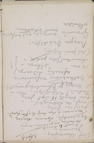
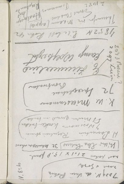
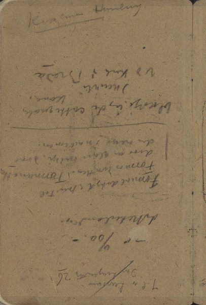
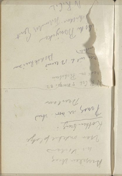
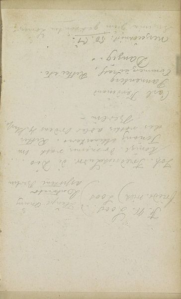
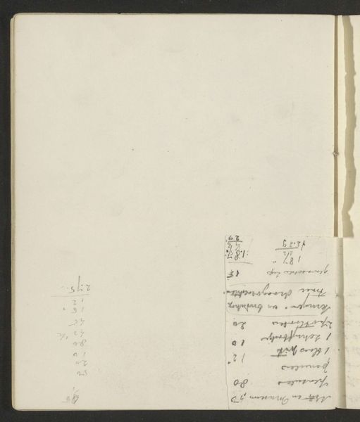
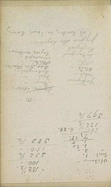
Curator: We're standing before a drawing by Johannes Tavenraat titled "Lijst," created sometime between 1854 and 1868. It's a handwritten list rendered in ink on paper, currently held at the Rijksmuseum. What's your initial impression? Editor: Immediately, I'm struck by the faded, almost ghostly quality of the ink. The lines are thin and delicate, creating a very fragile impression overall. It's a simple monochrome study, the composition dictated solely by the arrangement of these… entries, I suppose. Curator: Yes, "Lijst" translates directly to "list," offering a very literal description of the artwork. Tavenraat was working during a period of significant social change, so lists such as this could reveal how people were organizing and structuring their lives amidst those changes. Consider the growing professionalization and bureaucratization of society at this time—these sorts of records were becoming increasingly important. Editor: And structurally, we can look at how Tavenraat approached each mark-making gesture; from the angle of the text relative to the paper's edge, to the various sizing of letters and the flow of ink – aspects of his intentionality rise to the fore, whether planning this list as artwork or using the sheet in practice as personal notebook. The texture of the paper adds to this depth. Curator: Indeed, but whose activities and networks were being represented, and for what ends? How was the agency to categorize, name, and include distributed, and who was left out? Editor: From an analytical standpoint, it invites questions of syntax: the flow of meaning constructed across each horizontal set, inviting a comparative structural exercise when reading the drawing, or how we extract or apply information across it. The interplay between utility, composition, and texture make the whole artwork. Curator: Ultimately, looking at a simple list, it prompts deeper inquiries into structures of power and marginalization operating then, while inviting us to reflect upon those mechanisms and legacies continuing today. Editor: This work highlights a balance of form and function which I, having engaged in its raw and unpolished qualities, see to great artistic and social merit.
Comments
No comments
Be the first to comment and join the conversation on the ultimate creative platform.
More like this