Copyright: Toko Shinoda,Fair Use
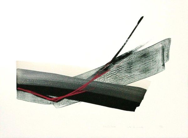
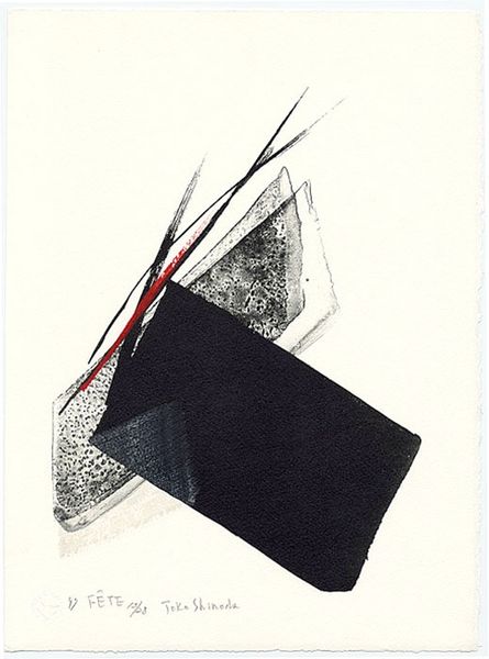
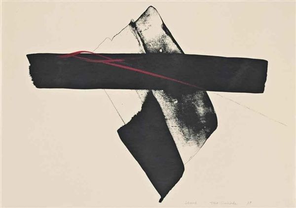
Toko Shinoda made this artwork, Relativity, with ink, probably sumi ink, on paper. You know, seeing it makes me think about how much artmaking is about reduction. Look how Shinoda uses just a few bold strokes to suggest depth, movement, even a kind of drama. The black marks are so decisive, almost like calligraphy, but then there are these softer grey areas, like shadows or echoes. Notice how the red lines zip across the composition, adding a jolt of energy. It's interesting how she balances the starkness of the black with the subtlety of the grey washes, and then BAM, those red lines pop, like a sudden insight. Shinoda reminds me a bit of Franz Kline, another artist who knew how to make a big statement with just a few well-placed marks. But where Kline is all about raw power, Shinoda has this elegant restraint, like she's holding back just enough to keep you guessing. Ultimately, her work really celebrates the power of suggestion. It's not about showing everything, but about inviting you to fill in the blanks.
Comments
No comments
Be the first to comment and join the conversation on the ultimate creative platform.
More like this