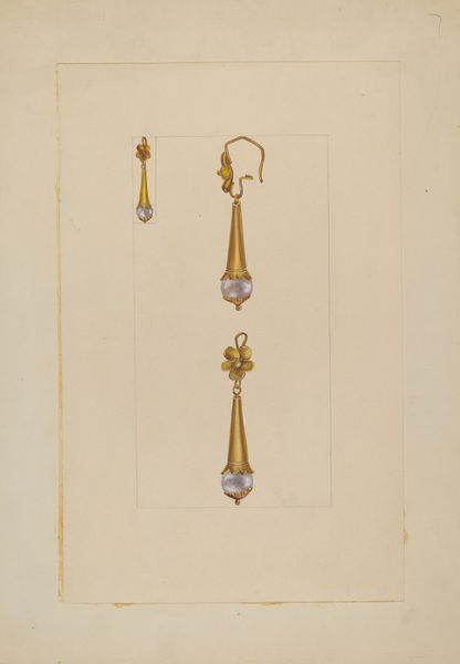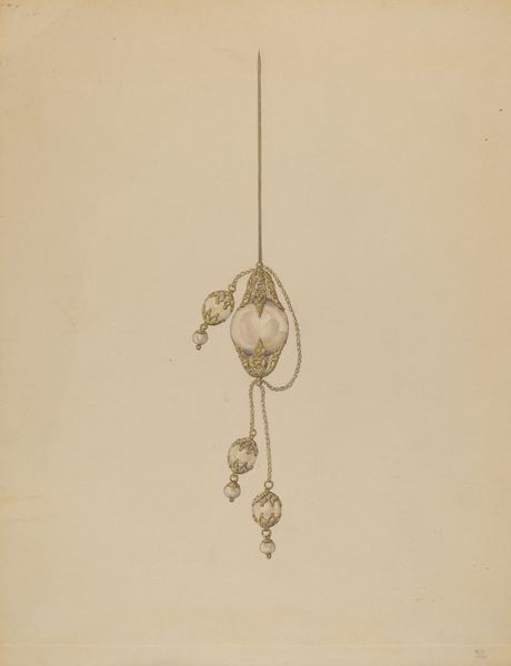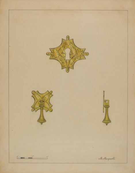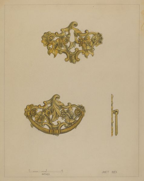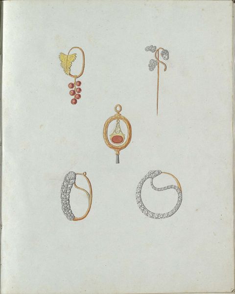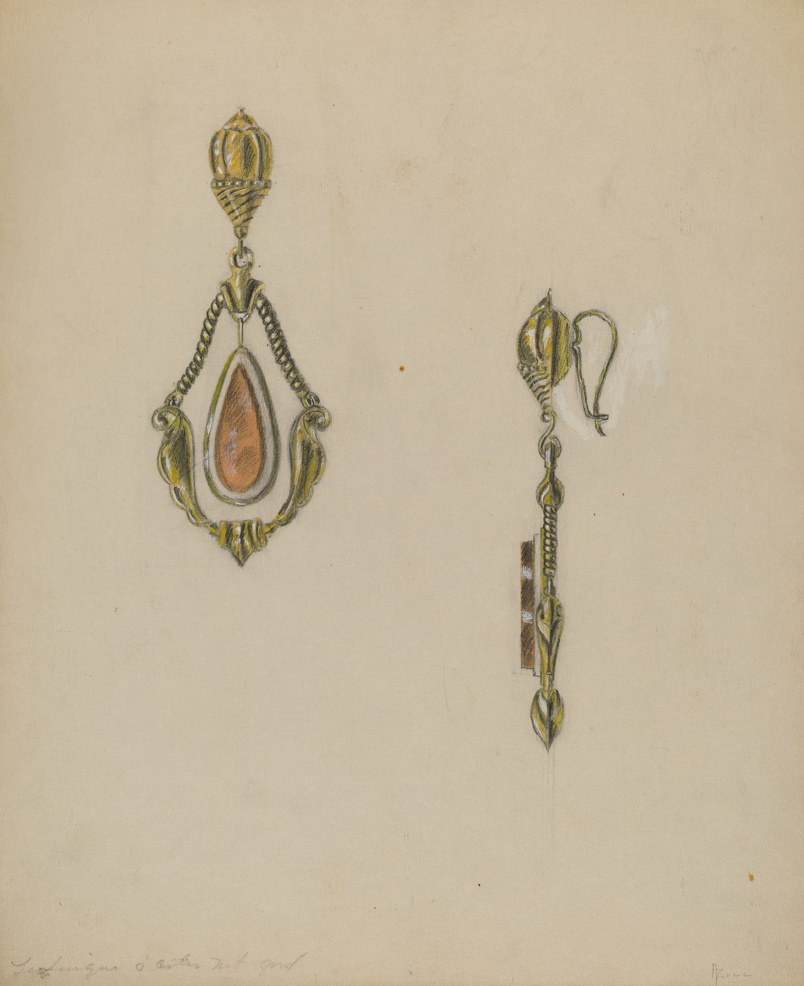
c. 1936
Earring
Listen to curator's interpretation
Curatorial notes
Editor: Here we have Theodore Kraus' "Earring," a colored pencil drawing from around 1936. What strikes me is the contrast between the ornate, almost Baroque design of the jewelry and the very simple, almost clinical, rendering of it. How would you approach interpreting this piece? Curator: A formal analysis reveals a strategic use of line and color to emphasize certain qualities. The objecthood is quite striking: the weight of the earring implied by its design pulls on the eye as though gravity were enacted on the page. Note the precision of the lines defining the earring’s structure against the almost casual application of color that creates volume. The lack of shading creates a sense of flatness despite this suggested volume. Do you see how this interplay between flatness and depth challenges our perception? Editor: I do! It's like a blueprint, but a fancy one. Almost like a three-dimensional object rendered in two dimensions, but without the usual tricks for creating that illusion. Curator: Precisely. And how does the color palette affect your reading of the drawing? It’s almost muted, and somewhat monochromatic; the limited use of golds and pale oranges flattens any sense of opulent preciousness usually associated with jewelry design of this kind. Kraus invites us to deconstruct this design piece by piece. He pushes it far from the traditions with which we may commonly link it. Editor: So, by stripping away some of the usual visual cues, he’s drawing attention to the core structure and form of the earring itself? Curator: Exactly. He seems most interested in the design, rather than the object's potential social implications. What I see is how color creates volume which also undermines depth, the combination rendering a visually fascinating, ultimately flat image of what in reality might have been something quite extravagant. Editor: This focus on structure rather than, say, the earring’s cultural relevance, makes this more interesting to me than I originally thought. It feels very forward-thinking in its approach. Curator: Indeed, the reduction to pure form, its visual grammar is quite remarkable when considered today, yes?