Copyright: Public domain
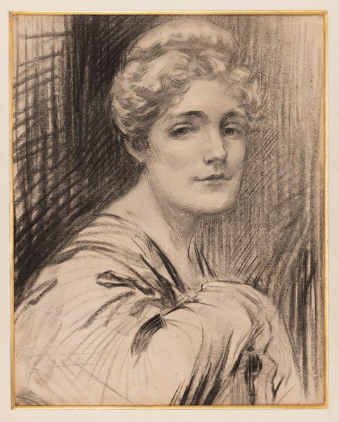
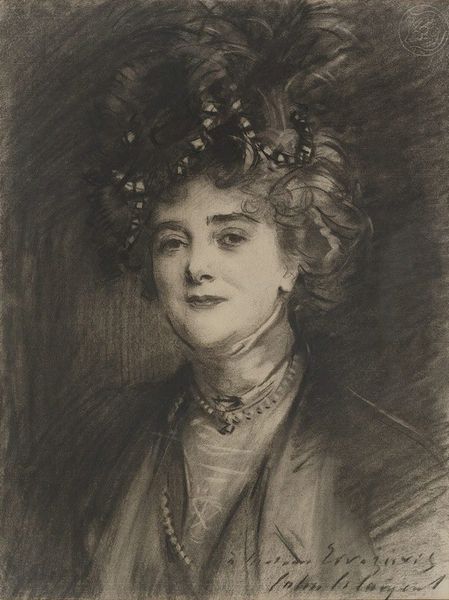
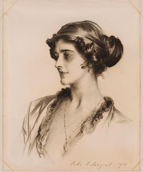
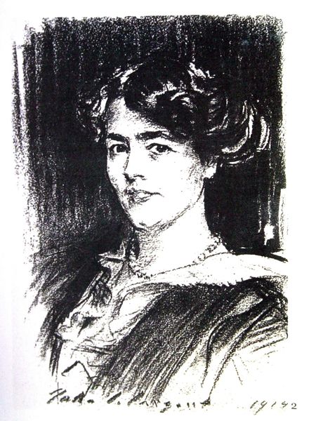
Editor: This is a graphite drawing by John Singer Sargent from 1913, called "Daisy, Princess of Pless." The softness of the medium and the subject's gaze give it a romantic, almost ethereal quality. What do you see in this piece from a formal perspective? Curator: Observe how Sargent manipulates value to construct form. The sharp contrasts defining the face—the light catching the nose and brow bone—yield to softer gradients delineating the gown and background. It is a study of how tonal shifts communicate spatial recession, isn’t it? Note, too, the textural variances. Editor: Yes, I see that now! The face is so precise, while the background dissolves into these loose, expressive strokes. Is that contrast purposeful? Curator: Undoubtedly. Consider how this interplay draws attention to the face and particularly the gaze, which occupies the visual foreground, but without sacrificing the richness of the whole composition. The textural diversity within the grey scale contributes to its success as a romantic portrait. The drawing could not succeed without the diversity of line weights, could it? Editor: So it's less about *who* she is and more about how Sargent used graphite to bring her image into being, playing with contrasts and textures? Curator: Precisely. Forget the tiara and pearls for a moment: what do you learn about mark-making by analysing Sargent's compositional techniques here? What about how he models the human figure and how the varying forms contribute to meaning-making? Editor: That’s a completely different way to think about it. I was getting lost in the image itself. I’ll be analysing all my artworks like that from now on! Curator: Glad to have guided you.
Comments
No comments
Be the first to comment and join the conversation on the ultimate creative platform.
More like this