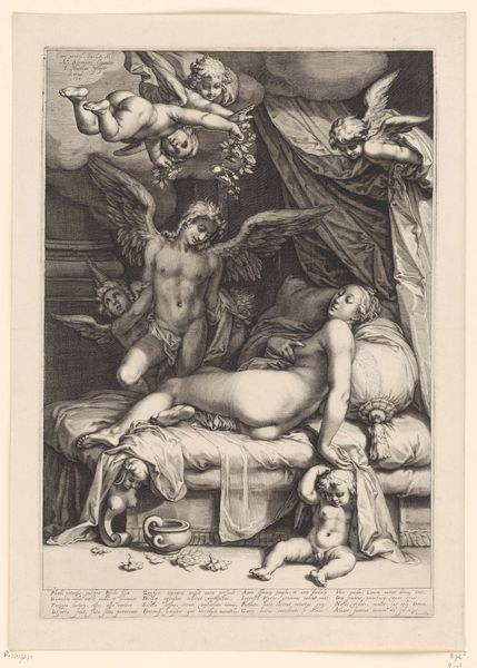
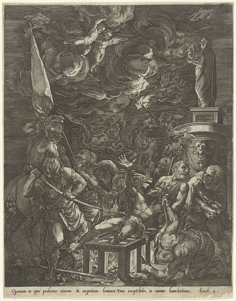
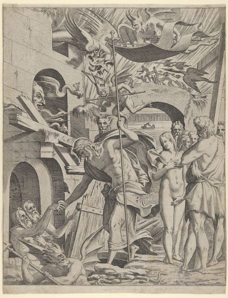
Voorzichtigheid weerhoudt de Tijd ervan antieke beelden te vernietigen 1670
0:00
0:00
gerarddelairesse
Rijksmuseum
print, sculpture, engraving
#
allegory
#
baroque
#
pen drawing
# print
#
pen illustration
#
old engraving style
#
figuration
#
sculpture
#
history-painting
#
engraving
Dimensions: height 328 mm, width 205 mm
Copyright: Rijks Museum: Open Domain
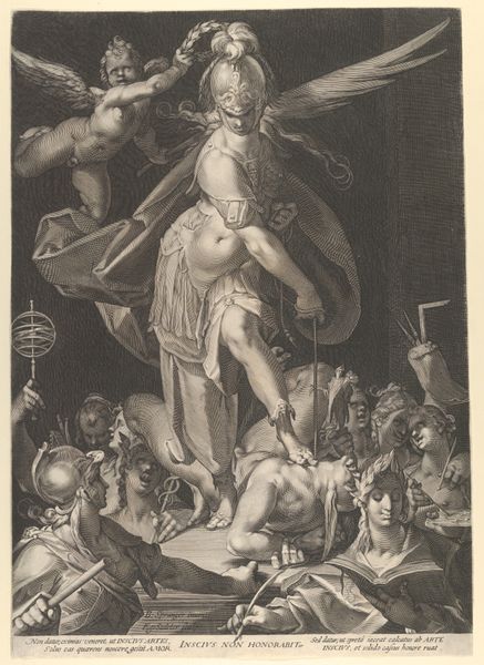
Curator: This engraving, dating back to 1670, is entitled "Voorzichtigheid weerhoudt de Tijd ervan antieke beelden te vernietigen," which translates to "Prudence Prevents Time from Destroying Antique Sculptures." Gerard de Lairesse is credited as the artist, and it resides in the Rijksmuseum. Editor: My initial impression is of high drama. The use of stark lines creates a very active composition. The figure of Time, with those arresting wings, seems caught mid-swing. Curator: Exactly. De Lairesse has employed the burin to carve out deep lines in the metal, then transferred that to paper, allowing for widespread consumption of this allegory. The contrast really emphasizes the struggle. It speaks volumes about the contemporary art market of Amsterdam, concerned with preserving antiquities from the ravages of time, neglect, or even active destruction. Editor: Yes, looking closely at the winged figure of Time, you notice he is being physically restrained. What strikes me is how dynamic Lairesse makes an essentially static medium. Notice the strategic use of light and shadow; the strong diagonals of Time's body and wings add that tension you mention, drawing our eye around the image. It creates a strong sense of movement. Curator: And those fragmented classical sculptures—it shows the growing antiquarian interest but also reflects a particular mode of artistic patronage. De Lairesse produced this as a kind of advertisement of Reynsts's sculpture collection, hence all the classical statuary, or rather, their images! This was all very much about establishing a kind of cultural capital. Editor: Precisely. I think that capital comes from De Lairesse’s compositional choices, it emphasizes the interplay between form and subject. The meticulous lines and intricate details capture the essence of Baroque aesthetics, and the image celebrates an intellectual interest. You can almost sense the weight and texture of both the classical sculptures, and Time himself. Curator: We can interpret this work through its labor value and intention: a luxury good, certainly, aimed at an elite, intellectual consumer interested in art and its power. I am sure this print functioned within networks of artistic exchange. Editor: Ultimately, the brilliance of this engraving comes from the composition, skillfully executed, using light and shadow to elevate a very serious allegorical scene that considers legacy itself.
Comments
No comments
Be the first to comment and join the conversation on the ultimate creative platform.
More like this