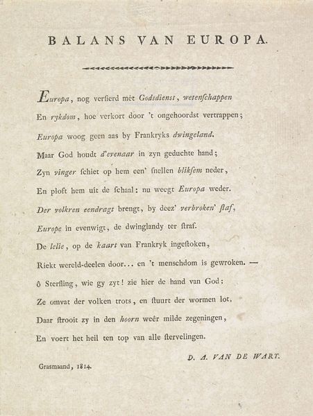
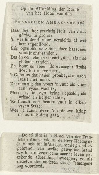
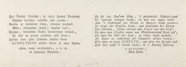
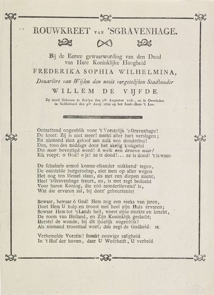
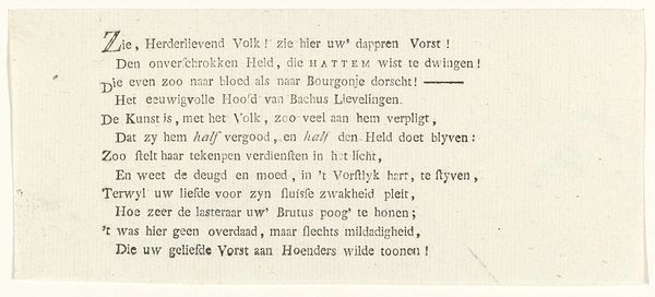
print, textile, typography
#
neoclacissism
# print
#
textile
#
typography
#
newspaper layout
#
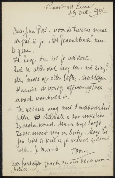
handwritten font
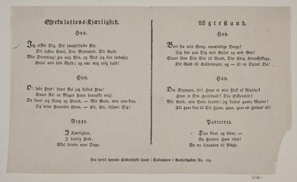
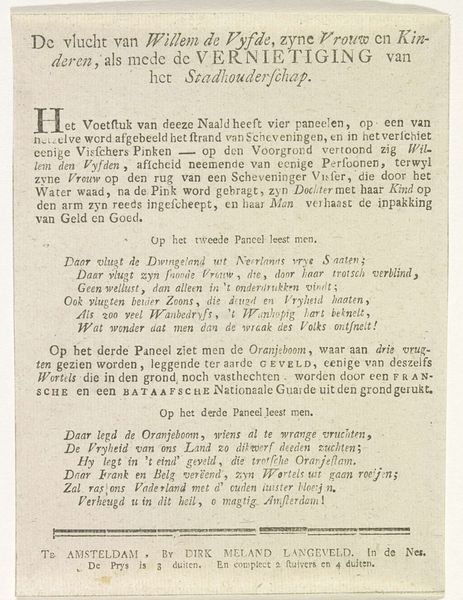
Dimensions: height 160 mm, width 80 mm
Copyright: Rijks Museum: Open Domain
Editor: We are looking at a print titled "Spotvers op de mislukte luchtreis van A. Hopman, 1805," created by an anonymous artist in 1805. It looks like it is on textile. It’s a dense block of text, giving it an imposing presence. How do you interpret this work from a formalist perspective? Curator: Its materiality speaks first, for the apparent integration of textile as material support calls to mind questions about artistic intentions regarding value, durability, and cultural identity. I see a focus on linguistic construction. What strikes you about the arrangement of textual elements? Editor: It almost looks like a newspaper layout; the handwritten font is unusual though. How does this contribute to its meaning? Curator: Precisely. The typographic choices highlight an intriguing contrast. Notice the stark dichotomy between form and function as an expressive tool. How might this interplay between aesthetic construction and literary delivery shape its reception? Editor: So, even though it’s text, the visual composition itself becomes part of the artwork’s message. It is interesting how the use of material, typography and language emphasizes intrinsic qualities of this artwork. I never thought about how form is so important! Curator: Precisely, one appreciates how meaning stems from an interplay of forms and functions within the aesthetic parameters of the object. The work then calls us to further investigate a relationship with semiotics.
Comments
No comments
Be the first to comment and join the conversation on the ultimate creative platform.
More like this