drawing, textile, paper, ink, pen
#
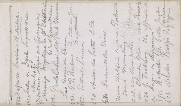
portrait
#
drawing
#
type repetition
#
script typography
#
hand-lettering
#
narrative-art
#
hand drawn type
#
hand lettering
#
textile
#
paper
#
ink
#
hand-drawn typeface
#
intimism
#
thick font
#
pen work
#
pen
#
handwritten font
#
calligraphy
#
small lettering
Copyright: Rijks Museum: Open Domain
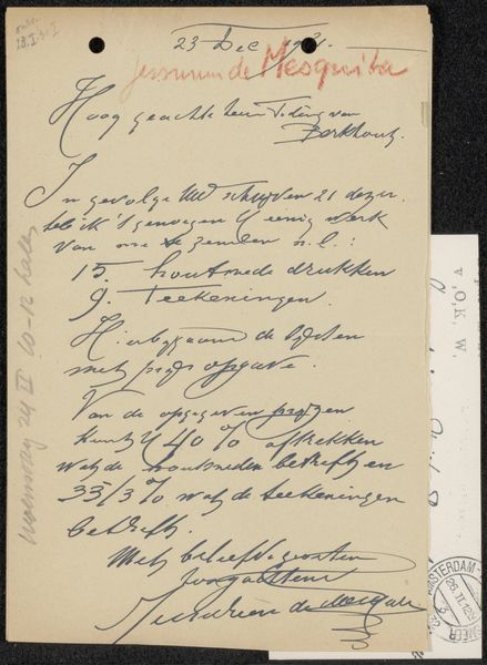
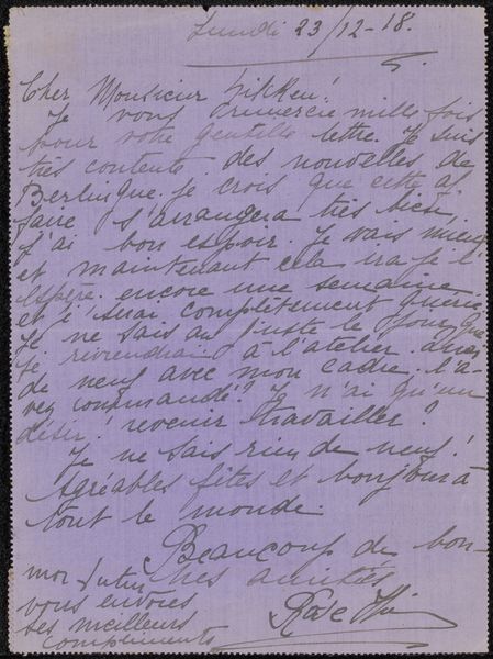
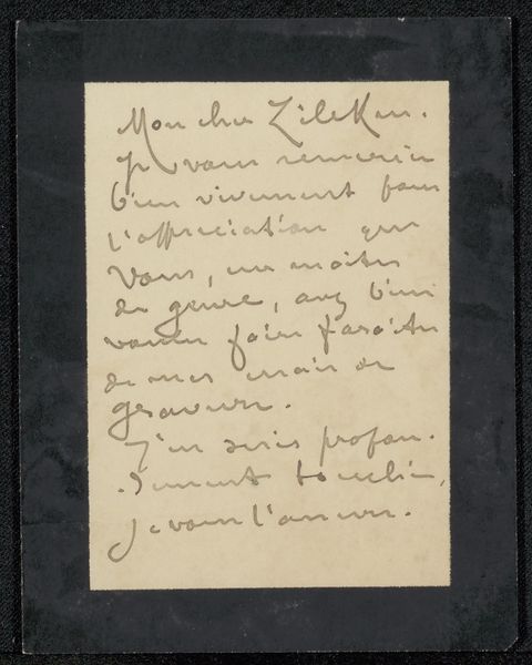
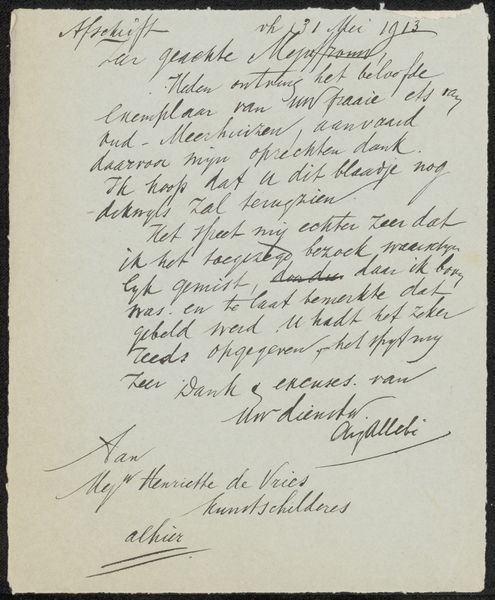
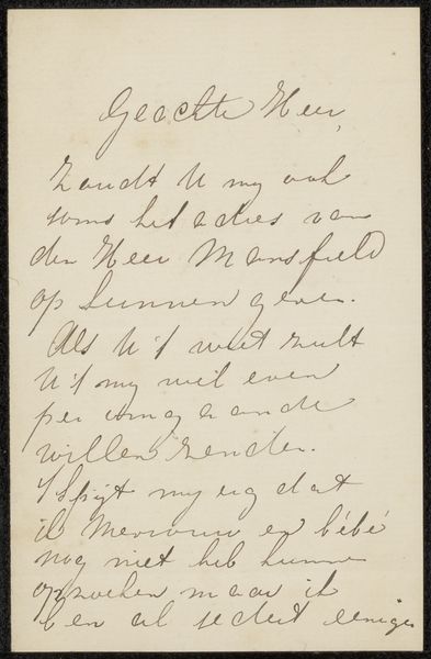
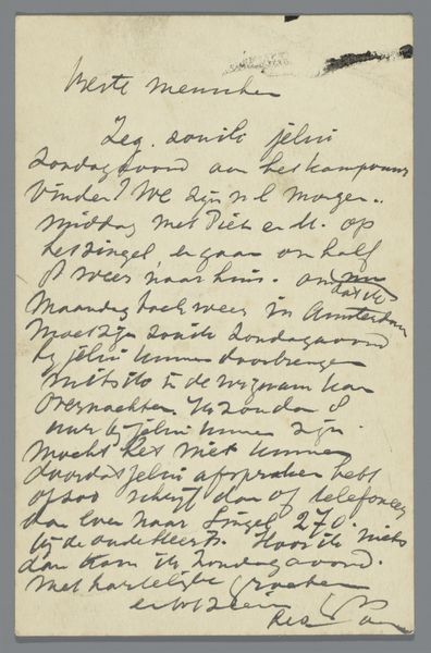
Curator: Here we have Elisabeth Cremers' "Brief aan Philip Zilcken," possibly from 1915, executed with pen and ink on paper. It strikes me first as an incredibly intimate object, both due to the handwriting and its function as a letter. Editor: Intimate indeed! Look at how the carefully lettered script fills the space. There's an interesting tension between the formality of the typeface and the obviously handwritten quality. The script really structures the picture plane. Curator: It's fascinating how handwriting style evolves and becomes culturally indicative. Here, the careful looping of the letters feels like an era's entire social structure condensed into linework. This level of penmanship signaled education, social standing, even one’s personality in ways we now outsource to digital fonts. Editor: Precisely. Consider how hand-lettering as a contemporary trend—perhaps seen on posters, wedding invitations—evokes this feeling. But those usages feel distinctly self-conscious and nostalgic, don’t you think? Curator: Yes, and if you examine it closely, you can appreciate how skillfully Cremers deploys the pen. The varied thickness and delicate hairlines in the letterforms creates a tactile richness; you almost feel the pressure she applied. Semiotically, those variations contribute a layer of authenticity that digital fonts could never replicate. Editor: What does the content of this brief tell us about its historical setting and purpose? It is written in Dutch; did it communicate something of the relationship between the sender and recipient? Curator: We learn she will meet “Heer Zilcken” on Monday at 2 p.m., answering his letter. A mundane social transaction that also opens the question: who was Philip Zilcken, what made the exchange important, and does such correspondence reflect broader artistic communities of the era? Was this, perhaps, about art? Editor: Exactly! The letter becomes a portal, linking this drawing to the whole socio-cultural landscape from which it sprung. A quiet, personal correspondence now acts a social artifact that informs public space. Curator: Indeed, what seemed so private, now becomes a matter of wider interpretation and broader public conversation, doesn’t it? Editor: Absolutely. The confluence of visual aesthetics and historical context really enriches this piece far beyond a first, calligraphic impression.
Comments
No comments
Be the first to comment and join the conversation on the ultimate creative platform.
More like this