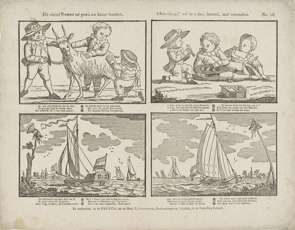
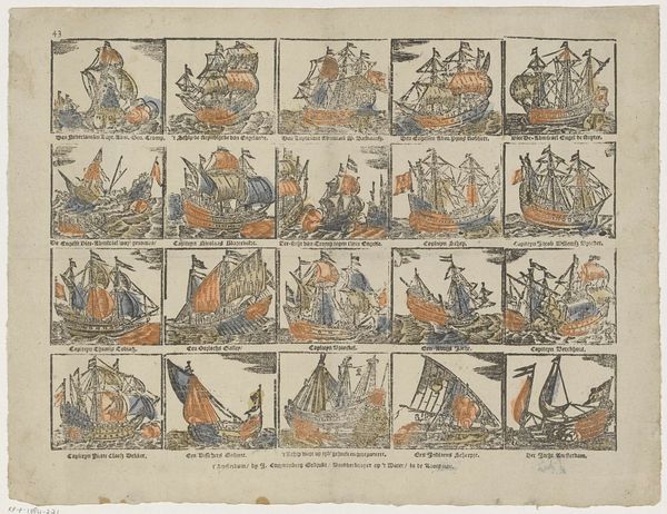
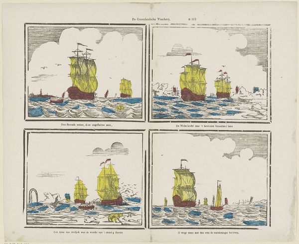
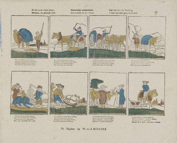
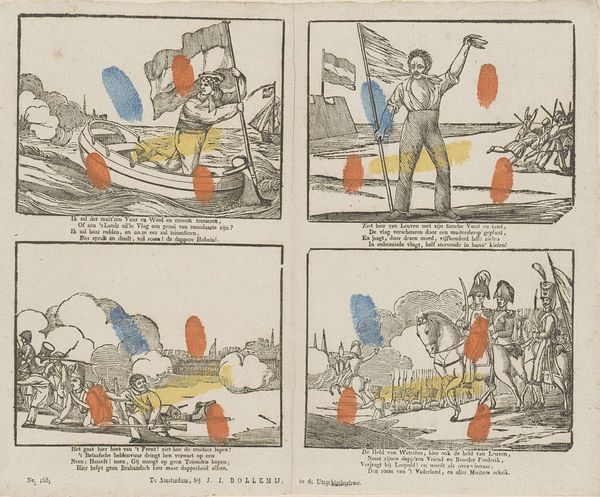
Daar hebt gij, kinderen, weer een tal / Van twee paar uitgezochte platen: / De helft is om van 't zoute nat, / En de andere, om van 't droog te praten 1850 - 1870
0:00
0:00
johannesegbertusvanlieshout
Rijksmuseum
#
comic strip sketch
#
narrative-art
#
dutch-golden-age
# print
#
landscape
#
figuration
#
comic
#
cityscape
#
genre-painting
Dimensions: height 295 mm, width 365 mm
Copyright: Rijks Museum: Open Domain
Curator: What a find! This playful print, dating from the mid-19th century, is attributed to Johannes Egbertus van Lieshout. It’s called "Daar hebt gij, kinderen, weer een tal / Van twee paar uitgezochte platen: / De helft is om van 't zoute nat, / En de andere, om van 't droog te praten"—quite a mouthful, which loosely translates to something about having pairs of pictures, some of the sea and some of the land. It’s currently held here at the Rijksmuseum. Editor: It’s strangely charming! At first glance, I thought it was something a child scribbled in their schoolbook. There is an honesty here in this collection of images that seem unbound and free flowing, I wonder what tale these separate scenes are telling us. Curator: That's astute! It presents four separate vignettes on a single sheet, rather like a comic strip. If we break down the semiotics, you notice recurring themes – the maritime world contrasts sharply with domestic scenes. The ships evoke Dutch Golden Age painting, perhaps reflecting national pride and maritime power, while the children seem to hint at moral lessons or genre scenes popular at the time. Note the use of space between each frame. It creates a journey for our eyes, which encourages a narrative from each individual viewing, yet it is limited by the other pictures contained within the space. Editor: Yes, and these quaint figures below with their goat seem oddly serious within this world. The artist, van Lieshout, seemed to hint toward social commentaries. Is that something the style eludes toward within the rigid boundaries of each pane, something so serious seems unplaceable? Curator: Possibly, the placement seems like he might be hinting at that. Remember this was an era where art was very much intended to instruct, particularly for younger audiences. This, although playful and rather rough around the edges in style, perhaps serves as a vehicle for simple morals. You have children observing each other’s playfulness, that is interesting I suppose in relation to each separate picture of Dutch national pride in its ship production above, what this image also hints towards within the style is the accessibility. These pieces would have been spread wider than a simple, single artwork might, to be more easily received and to carry that important didactic approach more fluidly. Editor: It makes you think of picture books and playful scenes captured in a fleeting childhood. The scenes offer this nostalgic look towards this Golden Age in maritime success alongside each small child, and somehow are given their own power through each pane's distinction, but similarity too. Curator: Agreed, it offers more than what meets the eye, that is very obvious. Editor: Indeed, it speaks of an intricate understanding and connection to culture and people during that epoch.
Comments
No comments
Be the first to comment and join the conversation on the ultimate creative platform.
More like this