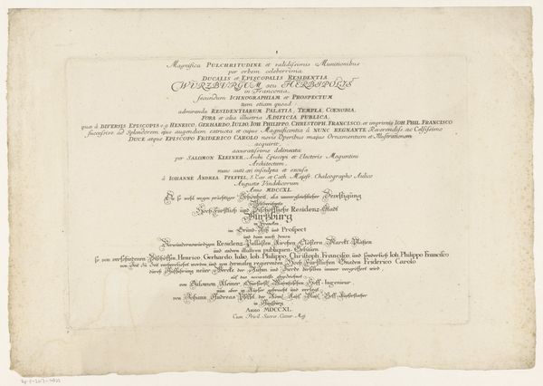
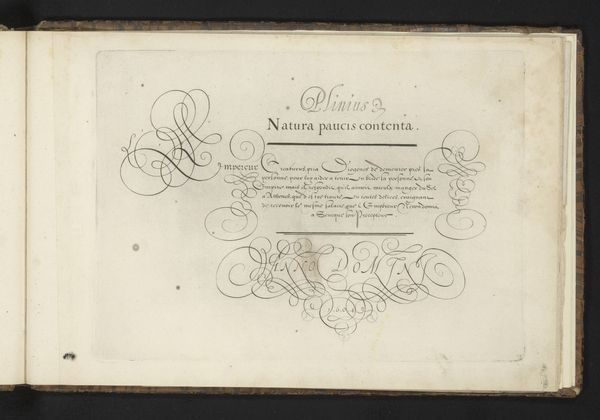
Titelpagina voor: Johann Georg Hertel, Pars I des berühmten Italiänische Ritters Caesaris Ripae, 1758 1758
0:00
0:00
johanngeorghertel
Rijksmuseum
graphic-art, print, paper, typography, engraving
#
graphic-art
#
baroque
# print
#
paper
#
typography
#
engraving
Dimensions: height 192 mm, width 127 mm
Copyright: Rijks Museum: Open Domain
Editor: Here we have a title page by Johann Georg Hertel from 1758, titled 'Titelpagina voor: Johann Georg Hertel, Pars I des berühmten Italiänische Ritters Caesaris Ripae.' It is an engraving on paper, so there's something beautiful in the contrast of light and shadow in the lettering. What immediately jumps out to you in terms of form and structure? Curator: Note the meticulous arrangement of the text; how the size and weight of the typeface varies. Consider 'Pars I' at the top: it is set apart by its grandiose, sweeping curves in comparison to the miniscule detail of the description further down. It signals the hierarchy of information while using aesthetic devices to appeal to the literate eye. What impression does the symmetry of this arrangement make on you? Editor: It feels incredibly deliberate, as though every line and letter was painstakingly considered. Does the typography itself reflect or allude to the contents it advertises? Curator: Precisely. Reflect on the balance between legibility and embellishment. Do you see how the Baroque period’s aesthetic is captured here? There is a commitment to elaborate detail within very structured confines; decoration becomes almost a framework in itself. Note the interplay of thick and thin strokes, the delicate serifs, the way the text fills, yet doesn't quite crowd, the available space. Consider also the texture of the paper itself. Editor: It makes sense. It’s not just conveying information but doing so with a very particular visual language. I hadn’t considered how much the texture contributes, adding a layer of antiquity and craft. Curator: Exactly. And these minute aspects coalesce to forge a sophisticated unity. Form is never separate from function; they reinforce one another in complex and fascinating ways.
Comments
No comments
Be the first to comment and join the conversation on the ultimate creative platform.
More like this