About this artwork
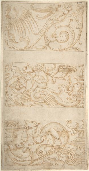
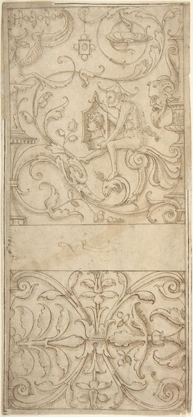
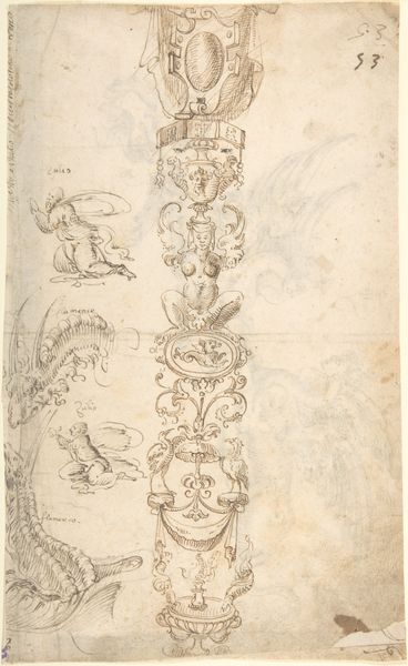
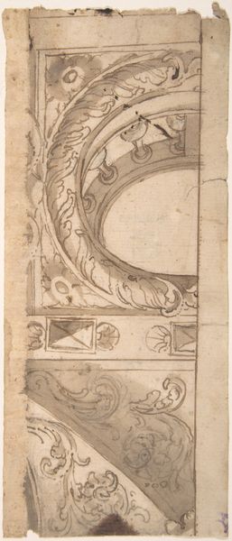
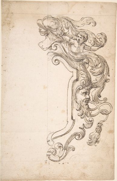
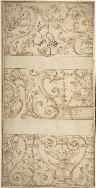
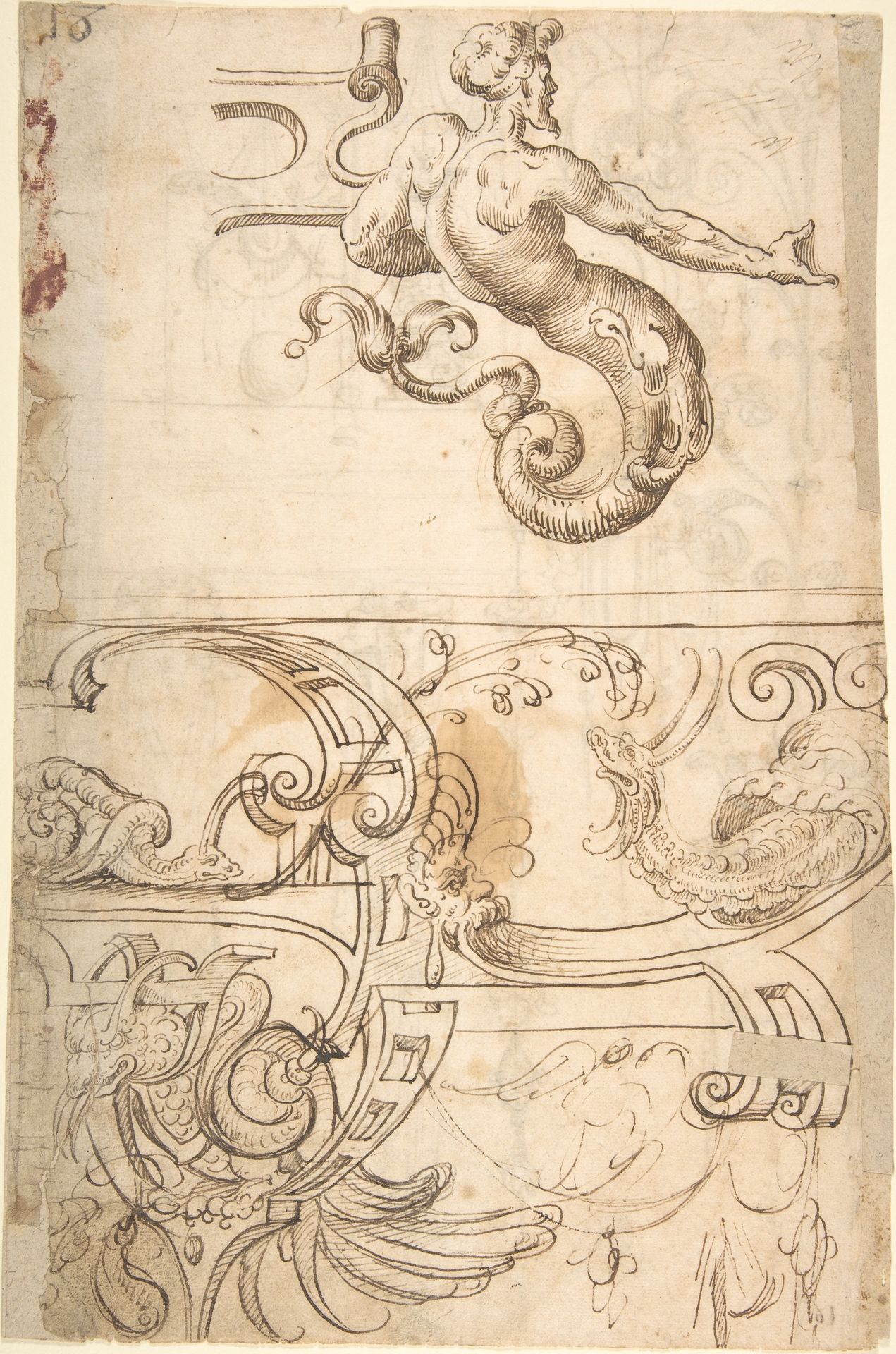
Curator: Let’s consider this sixteenth-century drawing, titled “Various Designs of Strapwork and Grotesque Figures” currently residing at the Metropolitan Museum of Art. It’s attributed to Andrès de Melgar, executed in ink. What are your initial thoughts? Editor: Immediately, I'm struck by the density of intertwined forms and the bestial character of the figures. It feels chaotic, almost nightmarish, yet meticulously rendered. There's a sense of underlying tension in the visual language that's intriguing. Curator: I agree; we are seeing, on a single page, the tensions inherent in representing the monstrous. In de Melgar’s time, this imagery would have functioned as social commentary, revealing anxieties around identity, religious transgression and gender. These grotesque figures challenged normative perspectives and visualized difference within societal contexts. Editor: The recurrence of monstrous figures definitely underscores this. Those figures are like visual short-hands. Think of how hybrid creatures appear in many cultures as protectors or symbols of chaos. What are they protecting here? What's the tradition that feeds these archetypes? Curator: It’s also vital that we discuss the purpose of “strapwork.” It was frequently employed in interior design during the Renaissance. When these drawings made their way into people's houses they began to shape an environment. The power to reconfigure domestic life according to humanist ideals should not be dismissed lightly. Editor: Right, but thinking of strapwork as an adaptable language of symbols gives this piece so much weight. The choice of the grotesque or human forms becomes a narrative choice as much as an aesthetic one, something that reveals societal pressures through its decorations. Curator: Ultimately, the brilliance here rests in de Melgar’s capacity to negotiate societal anxieties around acceptable forms of being within a two-dimensional composition. Editor: Absolutely. He wasn’t simply depicting the world around him, he was offering a framework of visual literacy—encoding power and vulnerability into a sort of accessible symbolic script. We can see now, just by the act of decoding it, just how effective that truly was.
Various Designs of Strapwork and Grotesque Figures (recto); Grotesques with Term Figures (verso) 16th century
Artwork details
- Medium
- drawing, ink
- Dimensions
- 13-1/4 x 8-3/4 in. (33.7 x 22.2 cm)
- Location
- Metropolitan Museum of Art, New York, NY
- Copyright
- Public Domain
Tags
drawing
figuration
11_renaissance
ink
geometric
history-painting
italian-renaissance
Comments
No comments
About this artwork
Curator: Let’s consider this sixteenth-century drawing, titled “Various Designs of Strapwork and Grotesque Figures” currently residing at the Metropolitan Museum of Art. It’s attributed to Andrès de Melgar, executed in ink. What are your initial thoughts? Editor: Immediately, I'm struck by the density of intertwined forms and the bestial character of the figures. It feels chaotic, almost nightmarish, yet meticulously rendered. There's a sense of underlying tension in the visual language that's intriguing. Curator: I agree; we are seeing, on a single page, the tensions inherent in representing the monstrous. In de Melgar’s time, this imagery would have functioned as social commentary, revealing anxieties around identity, religious transgression and gender. These grotesque figures challenged normative perspectives and visualized difference within societal contexts. Editor: The recurrence of monstrous figures definitely underscores this. Those figures are like visual short-hands. Think of how hybrid creatures appear in many cultures as protectors or symbols of chaos. What are they protecting here? What's the tradition that feeds these archetypes? Curator: It’s also vital that we discuss the purpose of “strapwork.” It was frequently employed in interior design during the Renaissance. When these drawings made their way into people's houses they began to shape an environment. The power to reconfigure domestic life according to humanist ideals should not be dismissed lightly. Editor: Right, but thinking of strapwork as an adaptable language of symbols gives this piece so much weight. The choice of the grotesque or human forms becomes a narrative choice as much as an aesthetic one, something that reveals societal pressures through its decorations. Curator: Ultimately, the brilliance here rests in de Melgar’s capacity to negotiate societal anxieties around acceptable forms of being within a two-dimensional composition. Editor: Absolutely. He wasn’t simply depicting the world around him, he was offering a framework of visual literacy—encoding power and vulnerability into a sort of accessible symbolic script. We can see now, just by the act of decoding it, just how effective that truly was.
Comments
No comments