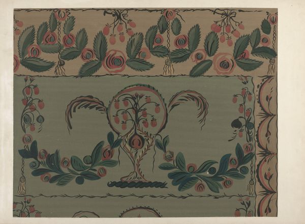
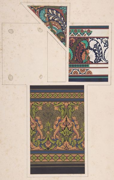
drawing, watercolor
drawing
pattern background
watercolor
folk-art
earthenware
watercolour illustration
decorative-art
Dimensions: overall: 56.6 x 73.7 cm (22 5/16 x 29 in.)
Copyright: National Gallery of Art: CC0 1.0
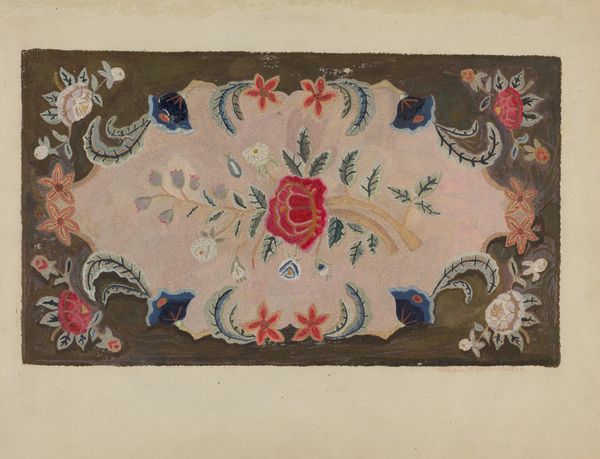
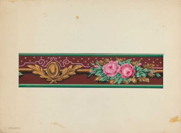
Curator: Chester Faris’s watercolor drawing, "Chest Design," was created between 1935 and 1942. It’s an intriguing piece. What are your immediate impressions? Editor: It’s certainly decorative. I notice the elaborate ornamentation. The folk-art style gives it an accessible, almost naive, quality. But what about the making itself? I mean, how does watercolor, typically associated with washes and fluidity, translate onto something mimicking carved and painted wood? Curator: An astute observation. It plays with the signifiers of craft versus art. Look closely. Faris meticulously builds layers of pigment to replicate the density of painted wood. The color choices—those earthy reds and muted greens—also contribute to that illusion. Consider also the composition, which suggests an adherence to traditional methods through the symmetry. Editor: Right, it imitates craft but remains distinctly…immaterial in a way the real thing is not. Are those stylized roses and foliage painted over or built up from the base layer? You could say he’s aestheticizing the idea of handmade objects rather than actually engaging in their material construction. Curator: Precisely. It seems to embrace decorative art, drawing influence from folk traditions while simultaneously distancing itself through the medium of watercolor. Note how the ironwork lock in the very center acts as a rigid anchor around which the painted ornament spirals. It offers structural order to the decorative impulse, creating formal interplay that transcends mere representation. Editor: So, it’s less about utility or the cultural significance of traditional chests and more about using the form as a framework, if you will, to explore purely artistic… or even abstract qualities. It strikes me as an elevation, or perhaps an appropriation, of vernacular traditions. Curator: One could certainly interpret it through that lens. I see an exploration of surface versus depth. He wants to offer a vision of everyday life that’s been consciously altered, elevated, if you like, to another level through design. The artist's decision to render it as a drawing almost negates it being anything else other than simply viewed. Editor: Ultimately, the tension between materiality and representation keeps this work so engaging. It makes you reconsider familiar objects and the labour from which they emerge.
Comments
No comments
Be the first to comment and join the conversation on the ultimate creative platform.