Copyright: Grace Cossington Smith,Fair Use
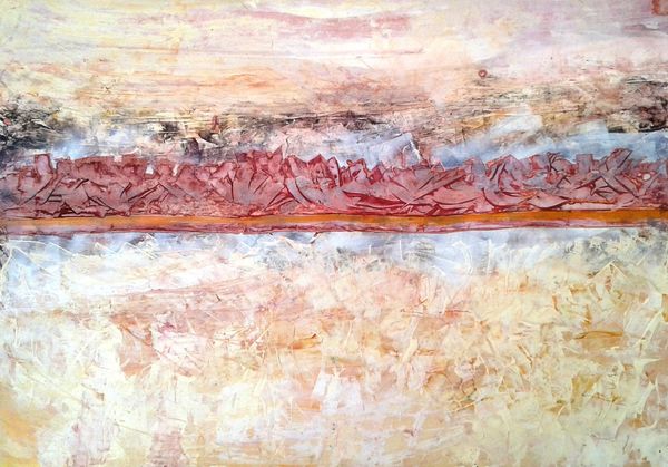
Grace Cossington Smith made this painting, Sea Wave, with what looks like watercolour in 1931. There's something deeply satisfying about how she’s built up the image with these small, almost rhythmic, marks. It’s like she’s not just painting a wave, but time itself, or a feeling. The texture is smooth. The thin, translucent washes of colour create a sense of depth and movement. Look at the purplish line that divides the waves from the sky. It’s not a realistic colour, but it captures the mood of the scene. The brushstrokes are directional, almost like the lines of a woodcut, and they create a sense of flow and energy. The colour palette is unexpected; muted greens, pinks, and purples give the wave a luminous quality. It’s a reminder that art isn’t about perfect representation. Cossington Smith’s interest in light and colour reminds me of the work of Agnes Martin. Both artists use repetition and subtle variations to create works that invite contemplation. The beauty of art lies in its ability to suggest, rather than define.
Comments
No comments
Be the first to comment and join the conversation on the ultimate creative platform.
More like this