drawing, graphic-art, typography, poster
art-deco
drawing
graphic-art
typography
poster
Copyright: Public Domain: Artvee
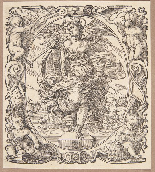
Curator: This graphic work, created by Richard Nicolaüs Roland Holst in 1924, is titled "Ontwerp voor; Diploma voor trouwe dienst bij Calvé-Delft." It's a design for a diploma acknowledging long service at the Calvé-Delft oil factories. Editor: It’s striking—the symmetry, the sharp lines, and the restrained palette give it a very formal, almost neoclassical feel, despite its clear Art Deco influences. Curator: Holst was deeply involved in socialist ideals. Seeing this diploma as an "honorary sign" sheds light on the changing relationship between workers and capitalist endeavors of that time. The inclusion of Mercury hints at speed, efficiency, trade - qualities that the factory perhaps wished to be associated with. Editor: The typography itself is masterful. The use of varying weights and decorative elements makes the text not merely readable, but integral to the visual impact. And notice how the geometric frame contrasts with the figure of Mercury; a play between rigidity and dynamism. Curator: Precisely! And Calvé-Delft wasn't just any company. These were major players in the Dutch oil and food industry, demonstrating their social concerns. Consider how such gestures shaped corporate identity and sought to inspire workers' loyalty. This drawing serves as a window into early 20th-century labor relations. Editor: Thinking about the visual weight, Mercury seems surprisingly static for a messenger god. The limited colour scheme also pulls against what would otherwise be a dynamic composition. Is it simply design restraint or an indication that Holst isn't *completely* buying into the glory of this commission? Curator: That’s a valid interpretation. Artists of that era were often grappling with conflicting ideologies, working within capitalist structures while maintaining their beliefs. It could definitely be read as an artist's subtle comment on industry and its impacts. Editor: Indeed. It’s a visually compelling example of how aesthetic choices intersect with ideology and industrial progress. Curator: An artwork that reveals as much about art history as about Dutch corporate culture. Editor: A perfect piece for studying the interrelation of style and socio-economics.
Comments
No comments
Be the first to comment and join the conversation on the ultimate creative platform.