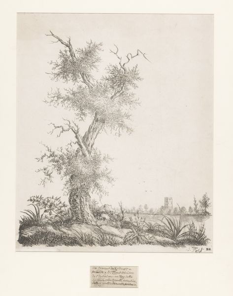
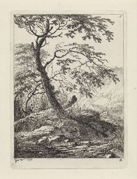
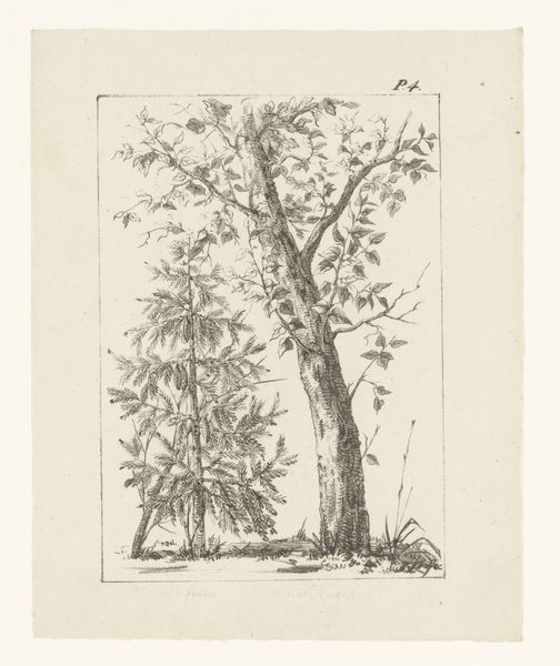
drawing, ink, pencil
#
landscape illustration sketch
#
drawing
#
pen drawing
#
pen illustration
#
pen sketch
#
old engraving style
#
landscape
#
ink line art
#
ink
#
ink drawing experimentation
#
romanticism
#
pen-ink sketch
#
pencil
#
line
#
pen work
#
sketchbook drawing
#
realism
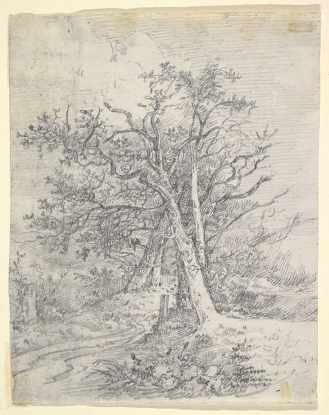
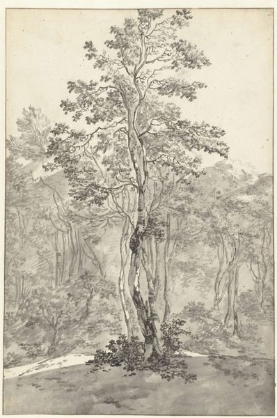
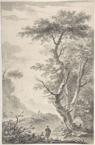
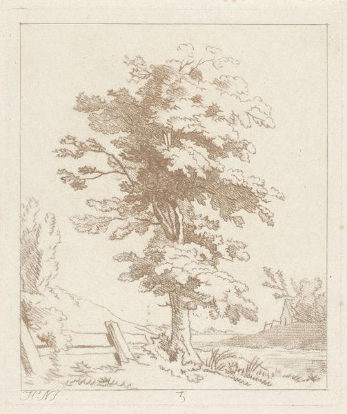
Dimensions: height 586 mm, width 451 mm
Copyright: Rijks Museum: Open Domain
Editor: This is "Twee lindebomen" – or "Two Linden Trees" – created between 1809 and 1841 by Joannes Bemme. It's a drawing, using ink and pencil. It gives me this immediate sense of detailed tranquility; the contrast is subtle and the details, particularly in the foliage, are incredible. What do you notice about its structure and composition? Curator: Focusing on its formal qualities, I’m struck by how Bemme creates depth using primarily line and tone, rather than color. Observe how the density of hatching varies across the picture plane. The lines are much denser and create darker values at the base, near the decaying fence, progressively becoming sparser to suggest the lightness of the sky and the furthest leaves. This use of varied hatching is interesting—does it create a sense of space for you? Editor: Absolutely! The finer lines at the top make the trees feel enormous, almost disappearing into the distance. But isn't it unusual that there is not much gradation in the sky? What could this signify in terms of balance? Curator: The stark simplicity of the sky emphasizes the intricate detail of the trees themselves. There's a clear juxtaposition between the unadorned negative space and the complex textures Bemme has so diligently rendered. Considering Bemme’s meticulous rendering technique, how might the negative space alter our reading of materiality within this artwork? Editor: That's fascinating. I hadn't considered the sky as an active compositional element before. By omitting detail there, Bemme forces us to appreciate the textures in the rest of the drawing. I'll certainly pay more attention to how artists use line and negative space in the future. Curator: Indeed. Understanding the function of these seemingly empty spaces allows for a more robust analysis. We start to see how these 'empty' elements of the drawing have tangible formal influence.
Comments
No comments
Be the first to comment and join the conversation on the ultimate creative platform.
More like this