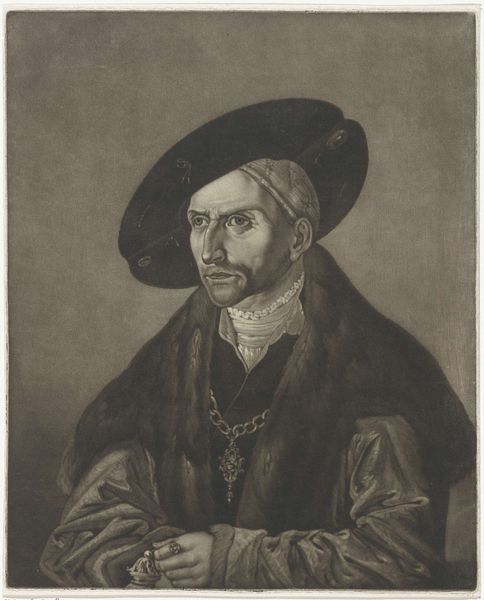
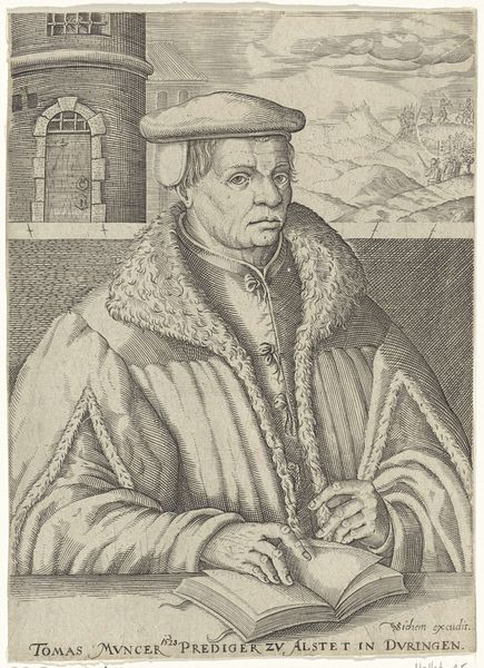
drawing, print, paper, engraving
#
portrait
#
drawing
# print
#
paper
#
11_renaissance
#
portrait drawing
#
engraving
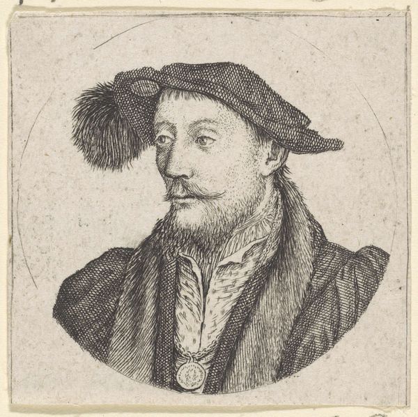
Dimensions: 131 × 95 mm (image, trimmed within platemark)
Copyright: Public Domain
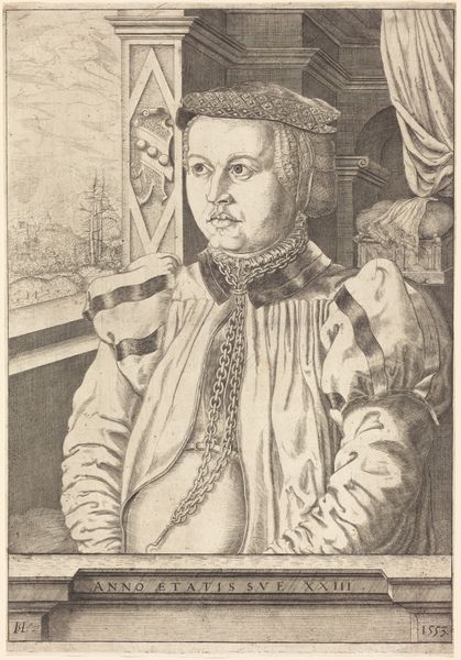
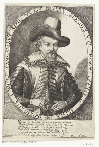
Curator: Before us we have Barthel Beham’s engraving “Erasmus Balderman” created in 1535, currently held in the collection of the Art Institute of Chicago. Editor: There's a striking somber quality to this portrait. The tight composition and the subject's direct gaze certainly command attention, almost as though he's assessing the viewer. Curator: Indeed, the composition is a masterclass in the manipulation of form and texture, carefully etching lines to give an astonishing three-dimensionality. Consider the meticulous detail of his garments juxtaposed with the clean, stark lines in the background; a visual balance creating dynamic tension. Editor: And consider the craft of printmaking at this time! It's not just about artistic skill; it's about understanding metallurgy, the labor of etching, the specific paper used, and even the socio-economic conditions that allowed for this type of print production to flourish. Did Beham make the paper himself? How did his labor practices differ from those painting similar portraits? These are tangible considerations. Curator: While materiality certainly informs context, it's vital to understand the image's internal relationships first. Note, for example, the inscription “MARCET SINE ADVERSARIO VIRTUS”—“virtue flourishes without opposition.” This inscription serves not only as a caption but contributes directly to the work's semantic field. Editor: But where does that sentiment come from? This piece, like many portraits, speaks volumes about status. Erasmus Balderman isn't just anyone; his portrayal and inscription signal the subject’s intellectual virtue to his peers, and, indirectly, suggests the aspirations and biases of those who might acquire and collect such a portrait. It reflects a culture of display, knowledge, and perhaps, social maneuvering. Curator: Nonetheless, to view the image solely through the lens of social utility is to negate Beham's virtuosity as a graphic artist. The delicate shading around Balderman’s eyes and the treatment of the subtle curves of his hat function primarily as pictorial, not societal statements. Editor: Yet, even that so-called “virtuosity” relies on the ready availability of materials—copper plates, inks, paper. To me, all the choices made from a printmaker's shop affect the final product’s artistic meaning. The lines and textures we see become so closely related to process, that it can’t simply be reduced to aesthetics. Curator: An insightful consideration, perhaps we have only scratched the surface, but thank you for your views. Editor: Likewise. Thank you for illuminating Barthel Beham’s detailed craftsmanship within the complex landscape of the Renaissance print world.
Comments
No comments
Be the first to comment and join the conversation on the ultimate creative platform.
More like this