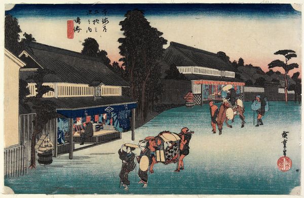
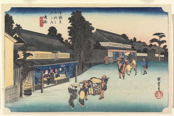
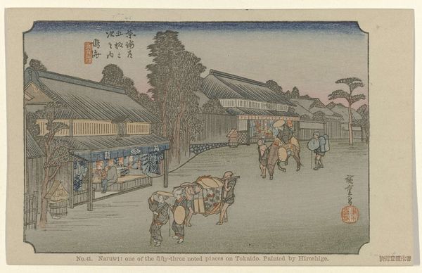
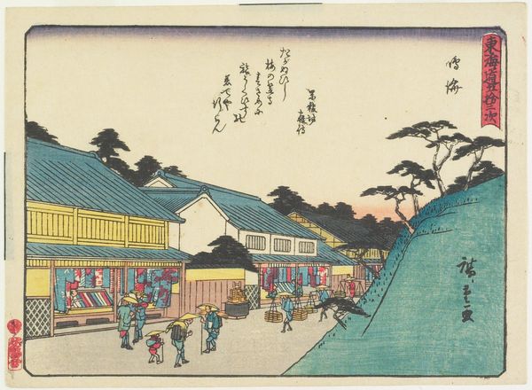
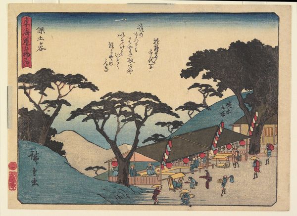
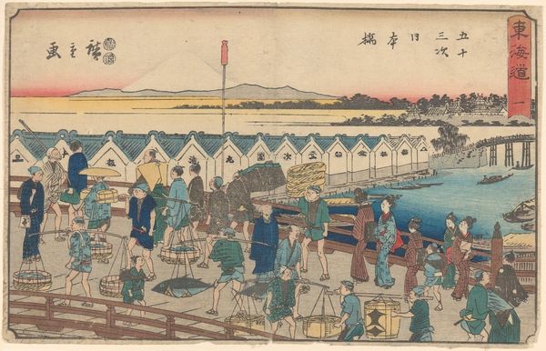
Narumi--Famous Dyed Cloth at Arimatsu c. 1832 - 1833
0:00
0:00
tempera, print, ink, woodblock-print, pencil
#
water colours
#
narrative-art
#
tempera
# print
#
asian-art
#
landscape
#
ukiyo-e
#
ink
#
coloured pencil
#
woodblock-print
#
pencil
#
cityscape
Dimensions: 9 1/2 × 14 1/4 in. (24.13 × 36.2 cm) (sheet, horizontal ōban)
Copyright: Public Domain
Editor: So, this is Utagawa Hiroshige's woodblock print, "Narumi--Famous Dyed Cloth at Arimatsu", made around 1832 or 1833. I'm struck by the way he captures this quiet moment of everyday life with such subtle color gradations. What do you see when you look at this piece? Curator: Immediately, I'm drawn to the meticulous construction of space. Notice the interplay between the foreground, middle ground, and background, achieved through variations in line weight and color density. How do these compositional choices affect your perception of depth? Editor: Well, the receding buildings and figures definitely give a sense of distance, and the colour certainly fades out into the distance. But it feels almost…flat, too? Curator: Precisely. The formal qualities—the planes of color and the outlines—flatten the image while simultaneously creating spatial recession. It is a sophisticated interplay. What about the colour palette, predominantly blues and whites; does it strike you in any way? Editor: Yes! There's a sense of coolness to it, but not in a negative way. And look at how he uses the dark blue at the top to almost weigh the picture down. Curator: The careful consideration of tonal values creates a structured yet harmonious composition. The blocks of color operate independently and in relation to one another. What significance do you ascribe to these qualities? Editor: I guess, by breaking down the visual elements like that, I can see that even though it's a scene from everyday life, Hiroshige wasn’t just trying to copy reality. He was making deliberate choices to construct a very specific… mood. Curator: Exactly. We are invited to consider the constructed nature of the image itself, rather than a direct representation. Editor: That's a totally new way to think about ukiyo-e prints for me. It moves past just subject matter. Curator: Indeed. Recognizing the artist's structural choices gives us another way to access the artist’s intentions.
Comments
No comments
Be the first to comment and join the conversation on the ultimate creative platform.
More like this