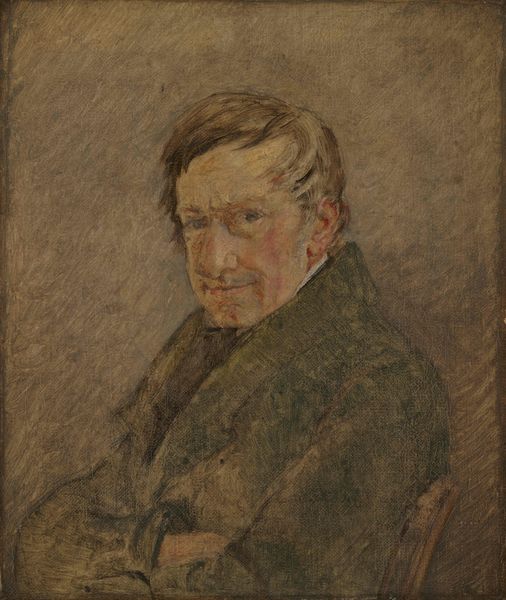
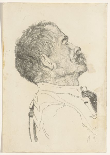
drawing, paper, charcoal, pastel
#
portrait
#
drawing
#
16_19th-century
#
dutch-golden-age
#
charcoal drawing
#
paper
#
oil painting
#
charcoal
#
pastel
#
academic-art
#
realism
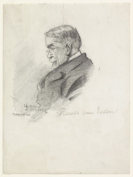
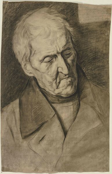
Dimensions: height 342 mm, width 250 mm
Copyright: Rijks Museum: Open Domain
Curator: Here we have Jan Veth's "Portret van een man, met neergeslagen blik," created in 1884. The artwork, rendered with charcoal and pastel on paper, currently resides in the Rijksmuseum. Editor: What strikes me immediately is its introspective quality. He looks burdened, doesn’t he? The downward gaze, the way he clutches his arms…it suggests a deep melancholy. And all of that is achieved with remarkably simple means. Curator: Indeed. Veth's skill lies in the suggestive quality of his marks. The way he employs charcoal and pastel feels both economical and emotionally rich. What type of paper did he use, I wonder, given its light color...Perhaps it has a social connection. Was he thinking of cheap alternatives at the time for mass distribution? Editor: Now that's a keen observation, and possibly what has made the drawing lasts up until now! These portraits are commodities, things for people to consume. Curator: Right, his technique has something real. The loose strokes bring it together, but it seems too academic in composition to have that loose stroke appeal. In any case, the very choice of drawing over painting seems to invite a certain rawness, an immediacy. It reminds me of poetry. Editor: Interesting you mentioned that! Veth could have gone for the oil or paint for realism's sake... and didn't! Think of the economics of using different medium during that time as well as access, especially within a dutch artistic lens that wanted realism to boom. Curator: Agreed, in its commitment to raw representation it might reflect an honest perspective that we appreciate now. Veth really knew how to pull heartstrings with those economical marks and tonal range. What starts as melancholy evolves into this gentle quietness, wouldn’t you agree? Editor: Absolutely, it’s the humanness of the materials themselves... they bring the humanity. Even today we engage and share our lives thanks to such simple elements that bring about beauty. Curator: Thank you for such a thoughtful dialogue, offering new perspectives that made me appreciate how economics and choices were really a foundation in Dutch Art and the overall goal to produce realism during its peak! Editor: Thank you for making this journey personal. Your comments really allow to highlight that our actions dictate the consumption of art... an introspective insight like Veth's is now very tangible.
Comments
No comments
Be the first to comment and join the conversation on the ultimate creative platform.
More like this