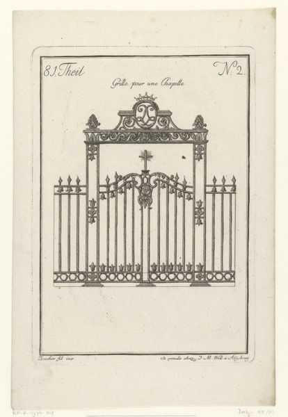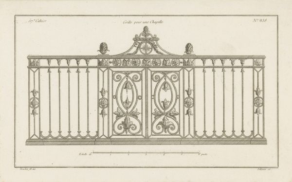
1745
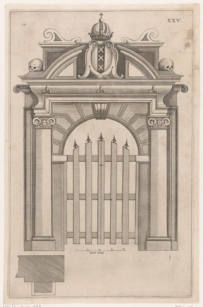
Koorhek
Carl Albert von Lespilliez
1723 - 1796Location
RijksmuseumListen to curator's interpretation
Curatorial notes
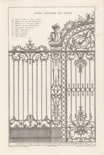
Curator: What strikes me most immediately is its density, that close hatching creates almost claustrophobic detailing across the entire image. Editor: We’re looking at an etching, engraving, and print, a decorative drawing titled “Koorhek,” created around 1745 by Carl Albert von Lespilliez, currently residing here at the Rijksmuseum. It depicts an ornate design for the choir screen of a church, exhibiting meticulous architectural planning. Curator: "Koorhek"—choir screen or gate—the perfect division between the sacred and the profane. The decorative-art feel really embodies a Baroque exuberance; even this preliminary sketch conveys authority and status. The geometric layout hints at more than simple ornamentation. The lettered diagram invites inquiry into its specific construction... but does this reflect how such objects functioned? Editor: It absolutely shapes our understanding of those social spaces. Architectural features like this visually and physically separated the clergy from the laypeople, reinforcing hierarchical power structures. Curator: It’s quite the spectacle. Every curve and flourish directs the eye upwards, instilling deference, perhaps awe. I’m compelled to consider whether these visual symbols would be readily "readable" across various groups of society? Or did their potency mostly impact elites already attuned to those cultural signs? Editor: This piece is certainly Baroque; consider its prevalence throughout church constructions of the era. The aim wasn't to ensure broad comprehension but to solidify ecclesiastical authority in architectural symbolism. This aesthetic itself had considerable socio-political connotations during that time. Curator: The symbols have continued resonating throughout society due to architectural marvels like the Vatican. A carefully designed screen like this would have influenced church goers whether consciously or not by the separation of the upper and lower sections. Editor: Absolutely. Its lasting appeal comes from a clever blending of form and function. It doesn’t just partition space but visually elevates faith and order. Curator: The print serves a role too by propagating and validating the architectural style beyond physical boundaries, offering both a model for imitation and perhaps even inspiring public awareness about the visual expression of ecclesiastical strength. Editor: It's intriguing to consider how these images mediate faith over time. By analyzing recurring icons, like the swirling details present on this screen, it helps us understand Baroque power, devotion, and maybe the weight of its artistic and institutional history too.