drawing, print, engraving
#
drawing
#
baroque
#
dutch-golden-age
# print
#
pen illustration
#
engraving
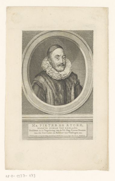
Dimensions: height 78 mm, width 69 mm
Copyright: Rijks Museum: Open Domain
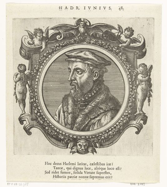
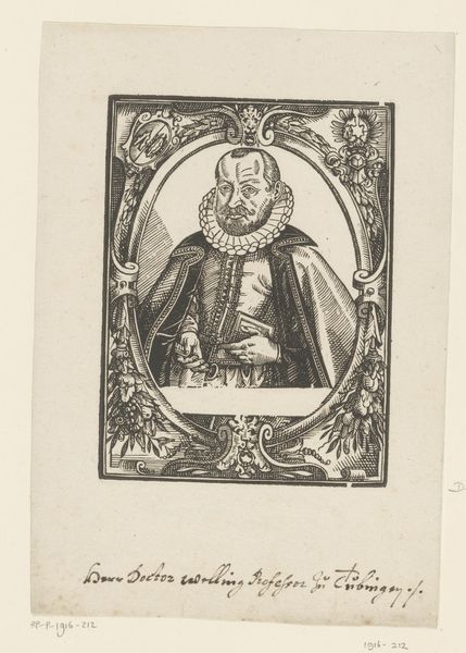
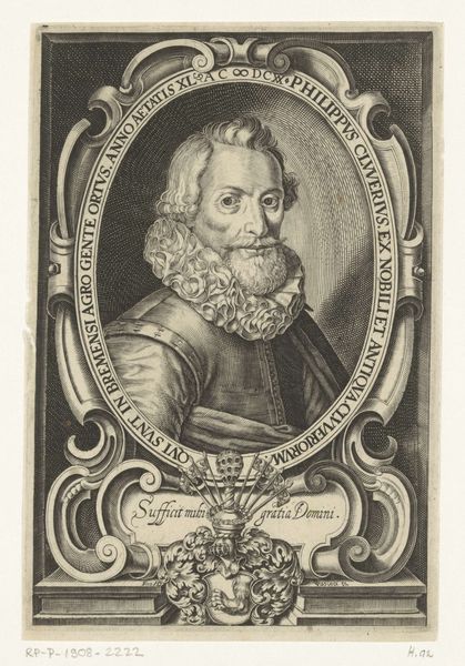
Editor: So, this is a print called "Portret van Willem Bartjens," made sometime between 1635 and 1694 by Dirck de Bray. It's a pen illustration and engraving, so, black lines on white paper. It strikes me as quite formal, maybe even a bit severe? What catches your eye? Curator: What grabs me is how such simple lines create so much texture. That ruff! It practically vibrates with detail. And look at the face; it’s a map of wisdom etched by time, yet there’s a glimmer of mischief in his eyes, don’t you think? It makes me wonder about Willem himself…Did de Bray know him personally, or was he working from another portrait? Editor: Hmm, I do see the texture now that you mention it. And the 'glimmer of mischief', okay, I'll buy that! What do you make of the ornate frame around him? Curator: It’s baroque extravagance meets Dutch Golden Age practicality, isn’t it? That frame is all flourish, saying, "This is someone important." But the direct gaze of the subject, the relatively simple lines within? That’s very Dutch. There is no idealization of the subject's features, no 'beautification' of the signs of aging. It almost feels like the frame is teasing the subject... Editor: It’s an interesting tension, that's for sure. I wouldn’t have noticed the Dutch influence without you pointing it out! Curator: Exactly! The beauty of art isn’t just in what you see, but in what you discover – what secrets the artist is hinting at just under the surface. Hopefully, that's something you can carry on into your own analysis. Editor: I think I have a much better understanding and appreciation for it now. Thanks!
Comments
No comments
Be the first to comment and join the conversation on the ultimate creative platform.
More like this