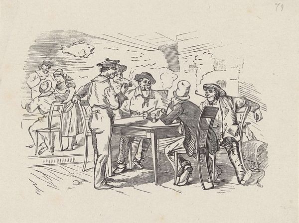
drawing, print, ink, engraving
drawing
medieval
narrative-art
figuration
ink
pen-ink sketch
line
sketchbook drawing
history-painting
engraving
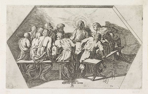
Dimensions: height 226 mm, width 331 mm
Copyright: Rijks Museum: Open Domain
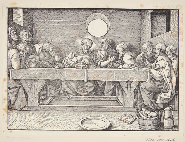
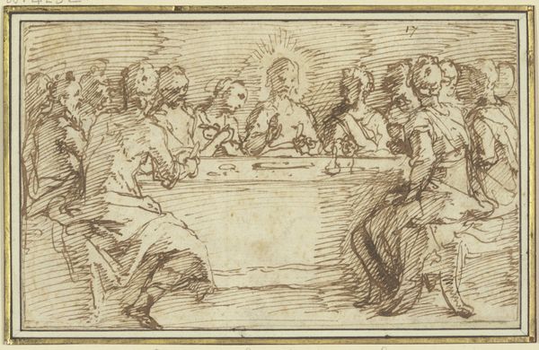
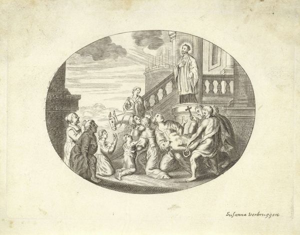
Editor: Here we have Jan Tersteeg’s "Last Supper," created between 1765 and 1807, an engraving rendered in ink. I’m struck by its almost stark simplicity; it’s more linear and less dramatic than other depictions I’ve seen. What compositional choices do you find most compelling in this print? Curator: The rigorous lines define space, but consider the absence of chiaroscuro – it forgoes the dynamic modeling that Caravaggio might employ. This stylistic austerity emphasizes form over emotion, creating a flattened picture plane which brings the foreground forward. How does this linearity affect your viewing experience? Editor: It makes it feel more like a diagram, maybe? Like it’s less about feeling and more about the structure. So, the formal elements become the focus? Curator: Precisely. Line dictates every aspect, reducing figures to linear representations and the texture comes alive. Note the deliberate hatching used to define volume rather than color. The overall composition speaks more to an exploration of form rather than devotional narrative. Editor: The expressions are subtle, the setting is minimized, and it is all about the lines and structure itself. Curator: Tersteeg appears primarily interested in translating the forms of Raphael's painting into a study of line and composition. Does focusing on these elements alter your interpretation of the work's subject matter? Editor: It definitely does. Seeing it less as a sacred event and more as an arrangement of shapes helps to bring fresh perspective. Thanks! Curator: Indeed, it underscores how visual language constructs and informs our understanding. Thank you for your questions.
Comments
No comments
Be the first to comment and join the conversation on the ultimate creative platform.