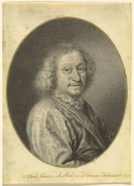
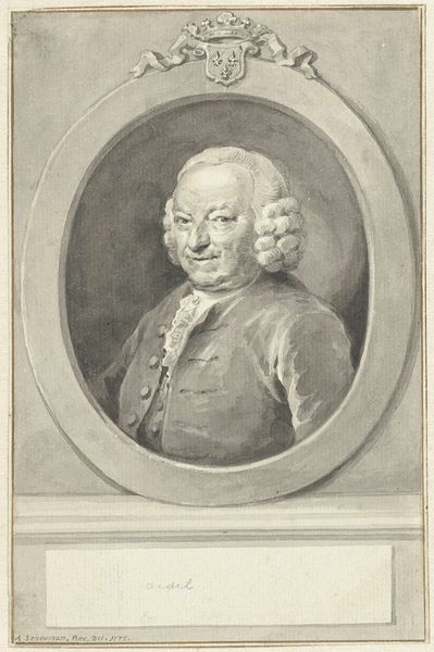
drawing, paper, pencil
#
portrait
#
drawing
#
baroque
#
caricature
#
figuration
#
paper
#
pencil
#
monochrome
Dimensions: height 142 mm, width 122 mm
Copyright: Rijks Museum: Open Domain
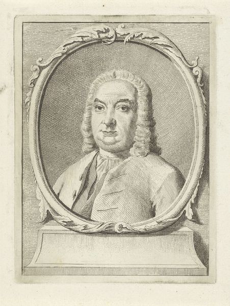
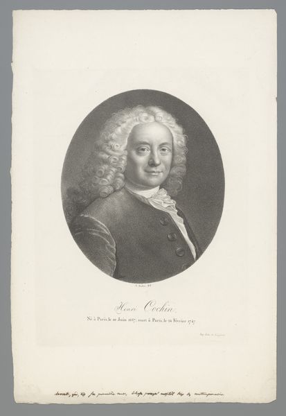
Curator: Let's consider this intriguing self-portrait rendered by Jacob de Wit sometime between 1705 and 1754, executed with pencil on paper. Editor: There's a curious stillness about this piece. The monochrome palette gives it an ethereal, almost ghostly quality, like a figure emerging from the shadows. Curator: The oval composition and monochromatic application provide a tightly unified structure, directing focus predominantly on de Wit’s features. The subtle variations in shading also skillfully imply volume and depth within a limited tonal range. Editor: And what do you read from that gaze? It's rather self-assured, wouldn't you agree? The almost excessively styled wig and attire speak of a desire for elevated status, of Baroque aesthetics. Curator: Yes, and his meticulous attention to detail. See how the lines create those elaborate curls, each seemingly distinct? This meticulous execution signifies not just technical prowess, but the subject's intentional self-presentation as one concerned with careful artistry and status. Editor: Indeed. One cannot overlook the fact that self-portraits in this era frequently serve as declarations of identity, visual emblems to future generations. De Wit, through these meticulously drawn features and the trappings of his status, immortalizes a very specific notion of himself. It hints at his understanding of permanence, his wish for how posterity would know him. Curator: It also functions effectively within the pictorial language conventions of the time; we might read his pose and confident gaze as devices to convey artistic authority. He understood how these markers operated in communicating a clear, specific message to his contemporaries, thus we also recognize a deep manipulation. Editor: Looking closer at the pencil strokes, there is an undeniable life imparted by this self-assessment, as well as the almost standardized elements that help the communication be read as true. I'll remember the image as de Wit sees fit. Curator: For me, this artwork operates as a case study on structure. The lines that construct both face and identity are inextricable, as De Wit would want.
Comments
No comments
Be the first to comment and join the conversation on the ultimate creative platform.
More like this