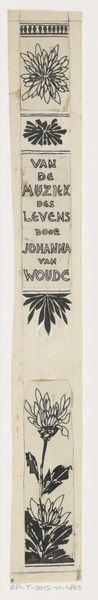
drawing, graphic-art, paper, typography, ink
#
drawing
#
graphic-art
#
art-nouveau
#
paper
#
typography
#
ink
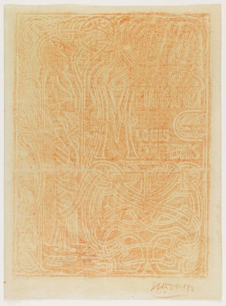
Dimensions: height 161 mm, width 126 mm
Copyright: Rijks Museum: Open Domain
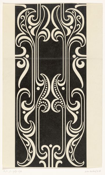
Editor: This is a band design for Johanna van Woude's "Van Hart tot Hart," dating back to around 1900, by Theo Neuhuys. It's ink and typography on paper, and I’m immediately drawn to the strong Art Nouveau style and the balanced use of black and white. What do you see in this piece, considering its form? Curator: Focusing on its inherent visual components, one observes first the highly stylized typography. Consider the rhythmic interplay of geometric and organic forms: the rectilinear blocks of text are juxtaposed against the curvilinear flourishes, creating a tension characteristic of Art Nouveau. Editor: The contrast between the straight lines and the swirling decorations is certainly eye-catching. Curator: Precisely. Notice the deliberate use of symmetry and repetition. The artist employs near-identical ornamental motifs at the top and bottom, framing the text. These visual devices serve to contain and emphasize the central message, creating a unified visual field. Ask yourself, does the specific construction support and strengthen the thematic expression of “From Heart to Heart?" Editor: I hadn't thought about it that way. It makes me see how form isn’t just decoration but contributes to meaning. Curator: Exactly. Observe too the distribution of positive and negative space. The solid black lettering is carefully balanced by the white, creating visual clarity, thus producing a coherent message through the use of the font itself as a statement. Editor: It's fascinating how much can be gleaned from analyzing its structural components. Thanks, I am going to pay attention to such details from now on. Curator: Indeed, close looking reveals an artful unity.
Comments
No comments
Be the first to comment and join the conversation on the ultimate creative platform.
More like this