About this artwork
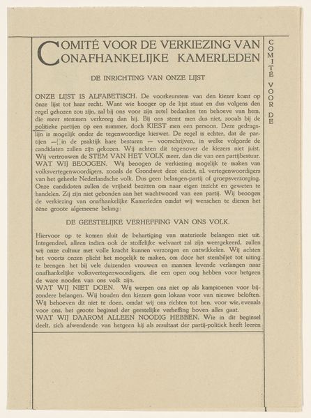
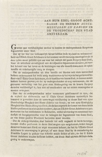
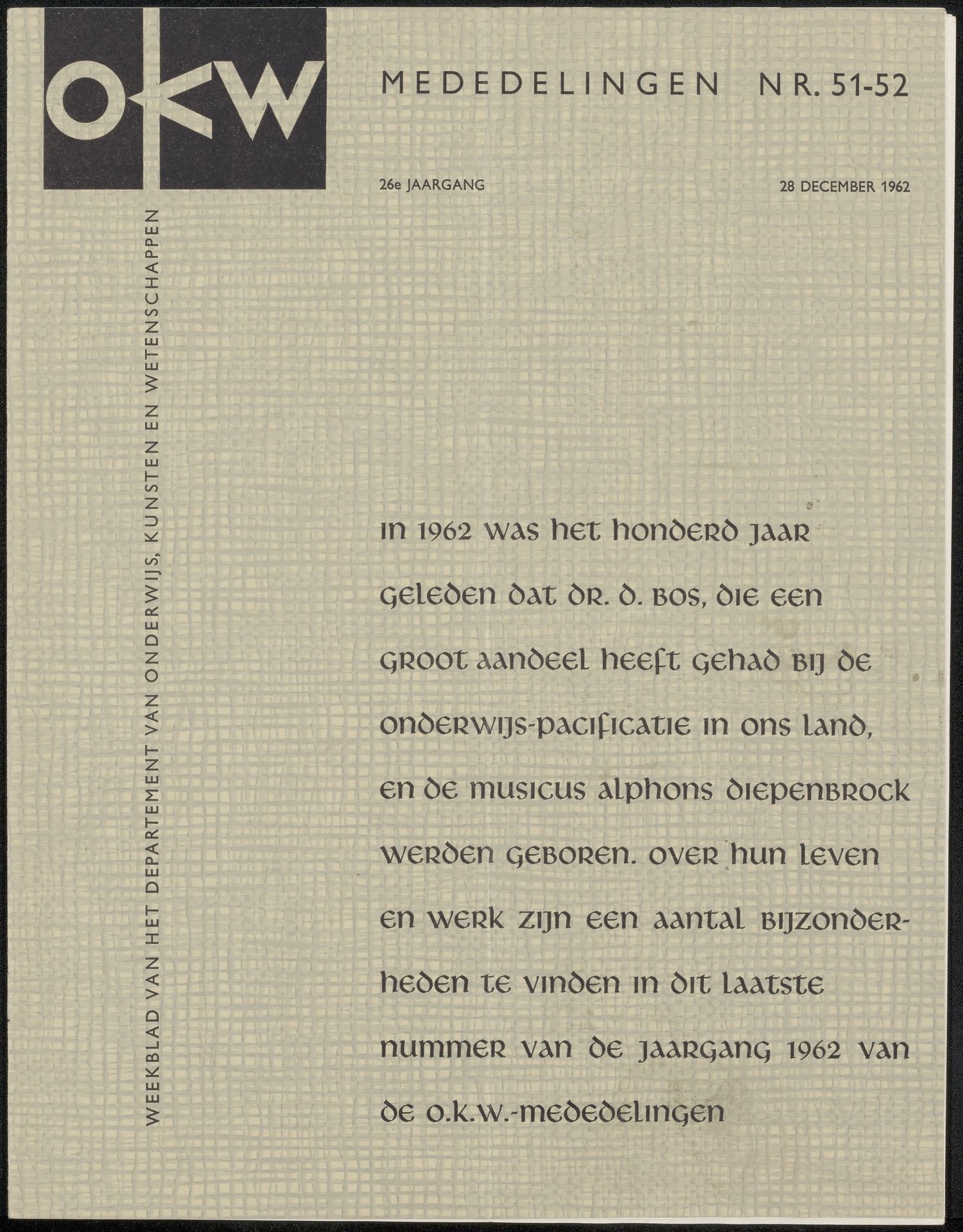
This magazine cover, "Tijdschrift uit archief Jan Veth," by diverse vervaardigers, was made in 1962 with ink on paper. The graphic palette is minimal; the design relies on a strong contrast between the pale, textured background and the dense black ink. I find myself drawn to the way the underlying grid gives the impression of woven cloth, something tactile beneath the crisp typography. It’s a reminder that even printed matter has a material presence. Take a look at the letters themselves. They're solid, uniform, and yet, when printed onto paper they feel inherently human. The arrangement of the text creates a visual rhythm, like a musical score. Looking at this cover, I can’t help but think of the covers designed by Alvin Lustig, or even some early minimalist art, like Agnes Martin’s grids. There’s a quiet, unassuming beauty to it, a testament to the idea that art can be found in the most unexpected places.
Artwork details
- Medium
- graphic-art, print, typography, poster
- Copyright
- Rijks Museum: Open Domain
Tags
graphic-art
typography
poster
modernism
Comments
No comments
About this artwork
This magazine cover, "Tijdschrift uit archief Jan Veth," by diverse vervaardigers, was made in 1962 with ink on paper. The graphic palette is minimal; the design relies on a strong contrast between the pale, textured background and the dense black ink. I find myself drawn to the way the underlying grid gives the impression of woven cloth, something tactile beneath the crisp typography. It’s a reminder that even printed matter has a material presence. Take a look at the letters themselves. They're solid, uniform, and yet, when printed onto paper they feel inherently human. The arrangement of the text creates a visual rhythm, like a musical score. Looking at this cover, I can’t help but think of the covers designed by Alvin Lustig, or even some early minimalist art, like Agnes Martin’s grids. There’s a quiet, unassuming beauty to it, a testament to the idea that art can be found in the most unexpected places.
Comments
No comments